In the past week two major public realm projects opened in Sydney: Barangaroo Reserve and The Goods Line.
Both are on my list to visit next time I'm in Sydney, and both were created on former industrial sites...
Your Custom Text Here

Typographic design by Nicole Phillips
In the past week two major public realm projects opened in Sydney: Barangaroo Reserve and The Goods Line.
Both are on my list to visit next time I'm in Sydney, and both were created on former industrial sites...
Last week the 2013 Think Brick awards were announced.
Brick has been undergoing somewhat of a renaissance here amongst designers. Perhaps it’s a simple case of today’s generation of architects discovering and appreciating the many super stylin’ brick houses created by great Australian architects at the peak of their game in the 1960s and 70s. (Treat yourself to a flick through Living and Partly Living if you need refreshing or convincing).
Whatever the reason, brick is suddenly ‘in’ again.
All this thinking about brick got me musing about the astonishing collection of buildings that make up the Zollverein World Heritage Site in Essen, Germany.

Essen is in the country’s central far west, part of the Emscher and Ruhr valleys that were the epicenter of Germany industrialisation.
Fuelled by extensive coal deposits, the collieries and steelworks of the region were critical to wartime armament production, and then to the post-war economic boom of the 1950s and 60s. As settlements and people followed industry and employment, this became the most densely populated area in the Ruhr valley.
Zollverein was established in 1847, when Franz Haniel bought and amalgamated 14 coalfields north of Essen. By the late 1920s the Haniel family company had been through several mergers, eventually becoming part of the largest steel group in Europe.
As tends to happen in these situations, hugely ambitious production and cost saving goals were set for Zollverein, and the plant underwent a major redevelopment.
Here’s where it starts to get interesting.
Architects Fritz Schupp and Martin Kremmer were engaged to design all the above-ground structures. Yes, even though the company was pursuing cost savings. Brilliant!
Working closely with the mine’s engineers, Schupp and Kremmer replanned the site, with a ‘production axis’ and an ‘energy axis’ intersecting at a large court in front of the main shaft building and pithead.
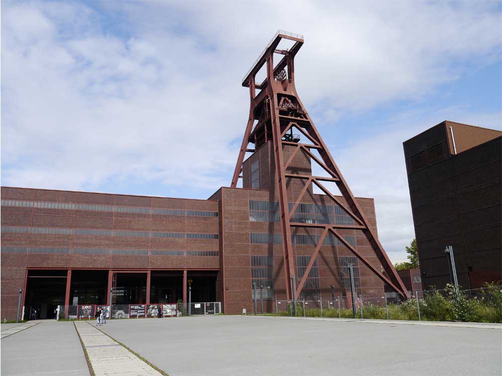
The functions of the site also influenced the architectural design. A system of steel framed structures, with brick and glass weather screens, was developed for the pit buildings, which, despite their different functions, all had to provide long clear spans and bear heavy vertical loads.

A refined and austere collection of steel framed and brick clad buildings was the result.
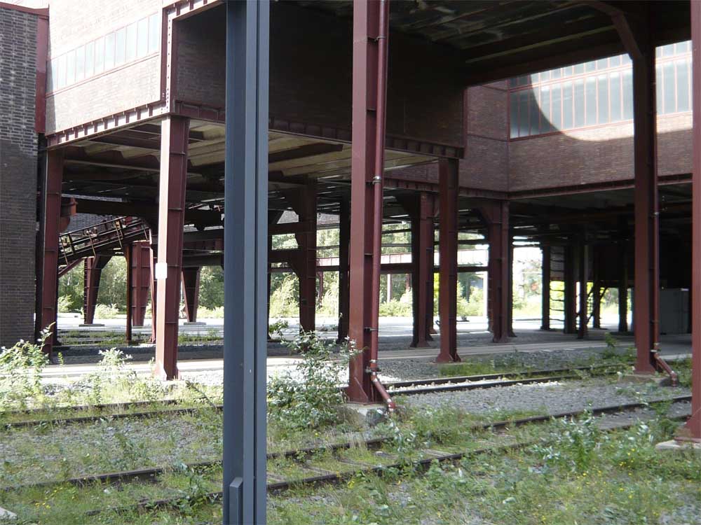
Adapting this system to each building gave a strong sense of order to to the site.
Contrasting the simple cubic forms was the mighty pit head itself, expressed in an open steel structure of great elegance.

When the new Zollverein opened in 1932 it quickly earned the title of ‘The Most Beautiful Colliery in The World’. I think that was a pretty fair call.
In the 1970s Germany started to become less competitive in the global coal market. By the late-1980s it was all over: mines, smelters, refineries, coking plants and blast furnaces all closed their doors and were silent. The last shift went down the Zollverein pit shaft in 1986. The coking plant closed in 1993.
The owners planned to clear the site. Many others fought to save it, and at the end of 1986 the entire shaft site was heritage listed. The state of Rhine-Westphalia bought the site from the city of Essen and from 1989 to 1999 it was rehabilitated and redeveloped.
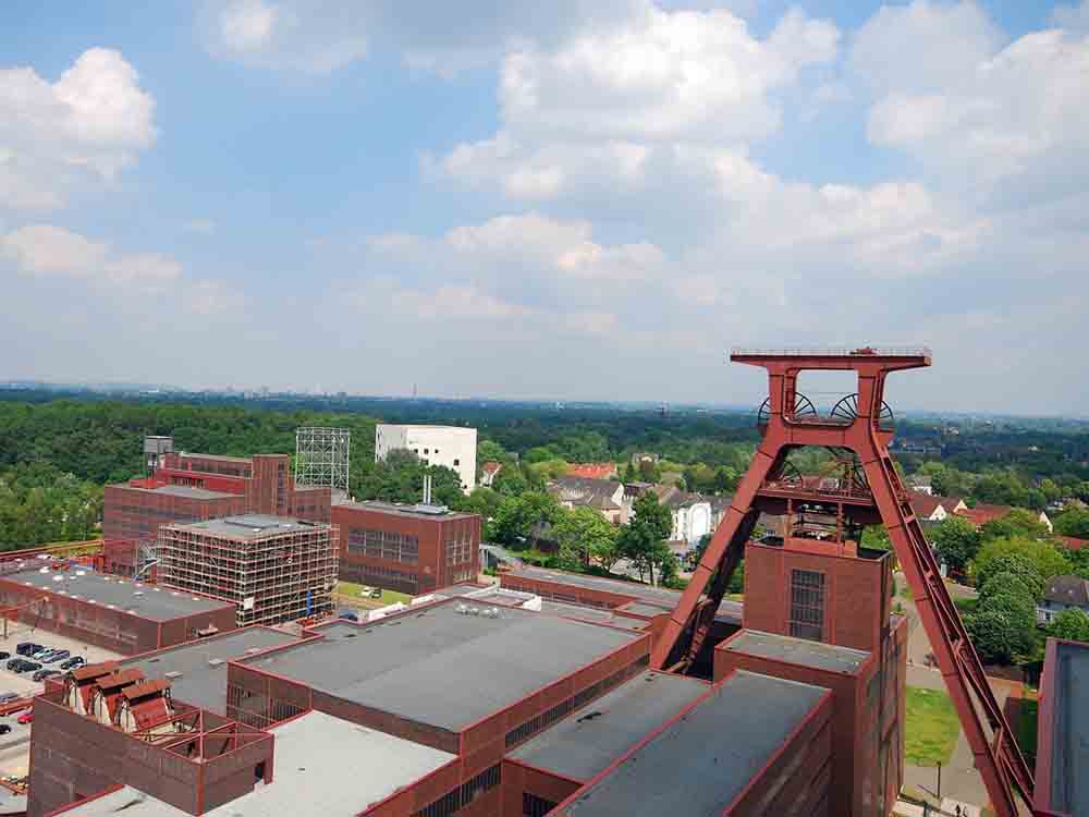
Today Zollverein is the cultural and artistic centerpiece of the Ruhr region, with the 55 metre high former pit head standing sentinel over the place.
Rem Koolhaas’s office, OMA, completed a master plan for the site in 2002. The landscape master plan was the work of Agence Ter.
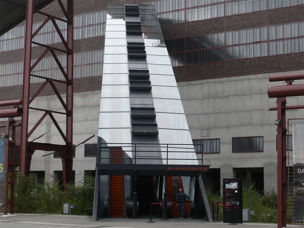
The coal washing plant, the largest building on the site, was converted into a Visitor Centre and houses the Ruhr Museum. Details in the loooong stair and escalator are inspired by flowing molten steel.

The Zollverein School of Design and Management occupies a building designed by Saanaa. Its pristine sugarcube form is inspired by the existing cubic structures.


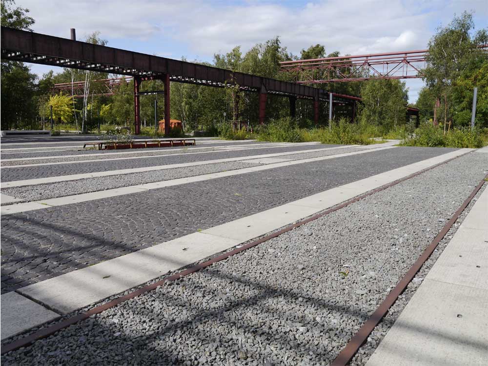
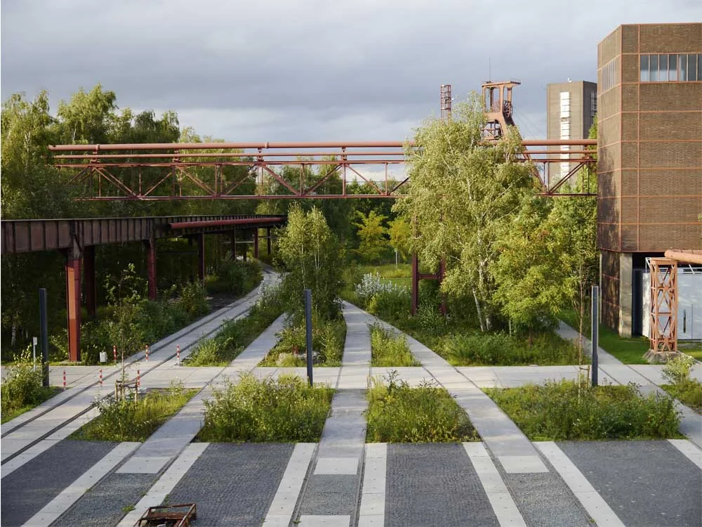
Nearby parts of the site look to have run wild.


Many of the older buildings are still off limits, awaiting their appointment with the makeover squad.

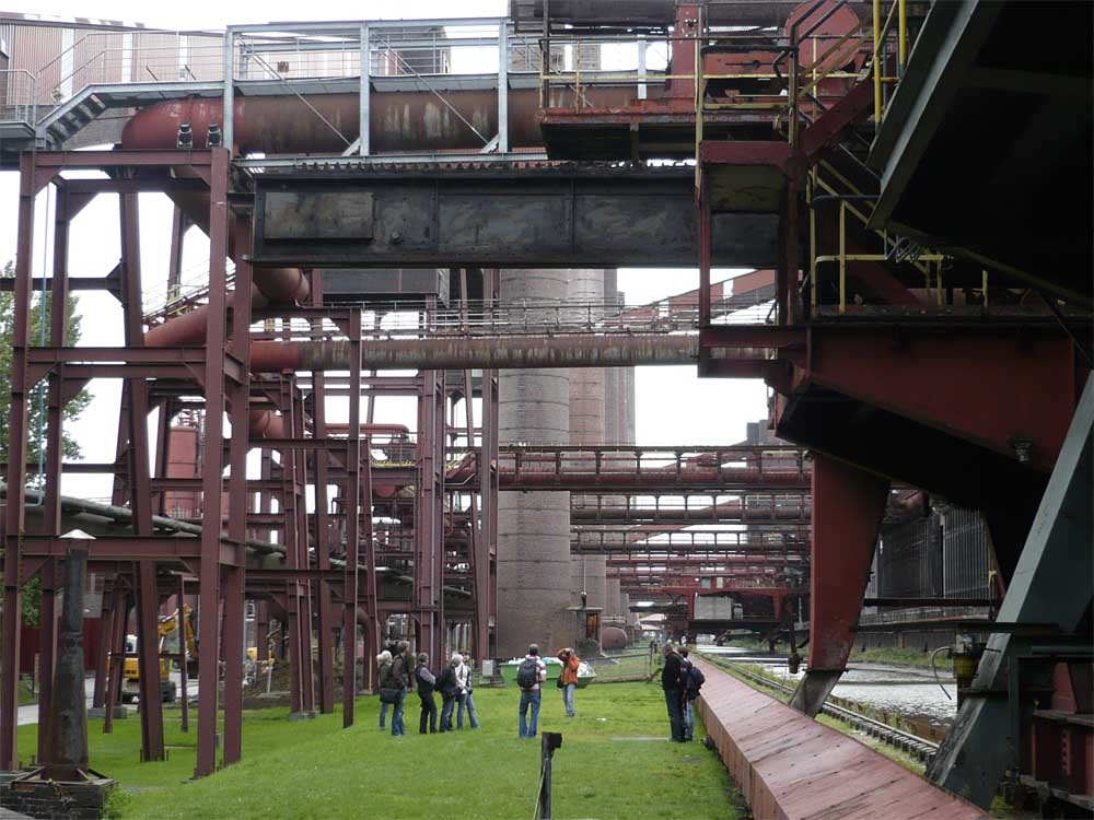
Just across the road (ie: take a packed lunch for your walk) is the former coking plant, a stupendous, 400 metre long affair trailing tentacles of pipes and gangways.

Visitors are dwarfed by the [insert superlative of choice here] structure.
At ground level, old machinery and equipment has been replaced by a Versaille-scale water body.

In winter there is skating!

In summer you can take a dip in the pool...

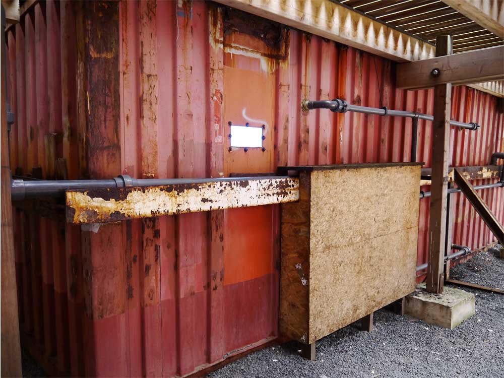
...or peek into the shipping containers holding the water below.
The rebirth of Zollverein coincided with the International Building Exhibition Emscher Park (the IBA), a ten year state government initiative tasked with achieving the ecological, economic, and urban revitalization of the Emscher River and Ruhr Valley.
One of the IBA’s radical development philosophy was the proposal that everything from the predominantly industrial past was worth preserving.
Visiting Zollverein today doesn't just bring you face-to-face with beautiful architecture, fine landscape architecture, and evocative ruins. It reveals a hugely important site of economic production that was previously off-limits except to its workers. It shows the power of vision and commitment to work with existing redundant infrastructure, and create viable new uses. And it works not just as a stand-along monument, but as a vital, and extraordinary link in a vast regional industrial landscape.
Now it’s over to you.
What do you think of the steel, brick and glass building treatment at Zollverein? Do you think Zollverein provides any clues for how we might think about mining and industrial sites here in Australia? Are there any that have been designed as proud civic buildings, or as part of a deliberate assemblage? What are our plans for our extractive industry sites once mining finishes?
I’d love to know your thoughts – join the conversation in the comments section below.
If you know someone who’d enjoy reading this article be sure to share it, and check back soon for more from the wonderful world of landscape, architecture and design.
Image credits:
Aerial view showing pit head and Saanaa building beyond
Image by Victor Bayon
File licensed under Creative Commons Attribution-NonCommercial-ShareAlike 2.0 Generic (CC BY-NC-SA 2.0)
Image retrieved from http://www.flickr.com/photos/formalfallacy/3641897195/sizes/l/in/photolist-6xPF9X-6xPfHt-6xPg5x-6xTPCN-6xT5nq-6xTPaL-6xT4JQ-6xPdAx-8yeLeV-8yeLJR-8yhNNy-8yhQ19-8yhQKN-8yhQpN-8yhN25-cqAaWm-9BbSDL-9BbR9u-9B8Yht-9B8YD2-5hDy4q-6y3o58-7HxSB2-5hzbNx-eAUc6r-eAUcEv-eAXky7-arKUrd-arKUEU-bkvTiK-4bumjE-7MYTn1-9saLzd-9s7MMR-9saLAG-aCaTKJ-7VKS4w-4bpqCi-8Gzqvy-8Gsvng-8GvG5Y-8GvBr5-a7krWL-5hzaXe-8rSi74-dkhf64-8rSebH-3uMKpW-3uMKNN-8EyfWg-4bq2fV/ on 10.08.13
Night skating
Image by Felix Montino
File licensed under Creative Commons Attribution 2.0 Generic (CC BY 2.0)
Image retrieved from http://www.flickr.com/photos/felixmontino/5305887665/sizes/l/in/photolist-95S4xP-gmH1L-5tKoXS-8seasf-apzPuZ-3uHgZH-9nw1ka-dRE3ZR-dKryhL-dJgCxw-6xPF9X-6xPfHt-6xPgpR-6xPg5x-6xTPCN-6xT5nq-6xTPaL-6xT4JQ-6xPdAx-8yeLeV-8yeLJR-8yhNNy-8yhQ19-8yhQKN-8yhQpN-8yhN25-cqAaWm-9BbSDL-9BbR9u-9B8Yht-9B8YD2-5hDy4q-6y3o58-6h6Q1U-7HxSB2-5hzbNx-eAUc6r-eAUcEv-eAXky7-arKUrd-arKUEU-bkvTiK-7zY15z-7zY15V-rAm9x-8MaSHK-8Gzqvy-8Gsvng-8GvG5Y-8GvBr5-a7krWL/ on 10.08.13
All other images by A. J. Wright and R. A. Buchanan.
Find out more about Zollverein:
Zollverein is located at Gelsenkirchener Straße 181, 45309 Essen, Germany. Its English-version website is currently being updated, but there is still some good basic info available. The German site is available at the same link.
Next to a busy freeway perhaps? On top of a rubbish dump?
How about next door to a sewage treatment plant?
The Newtown Creek Nature Walk in Brooklyn not only ekes out a sliver of public access to a contested waterfront, but brings visitors face-to-face with the biggest sewage treatment plant in New York City.
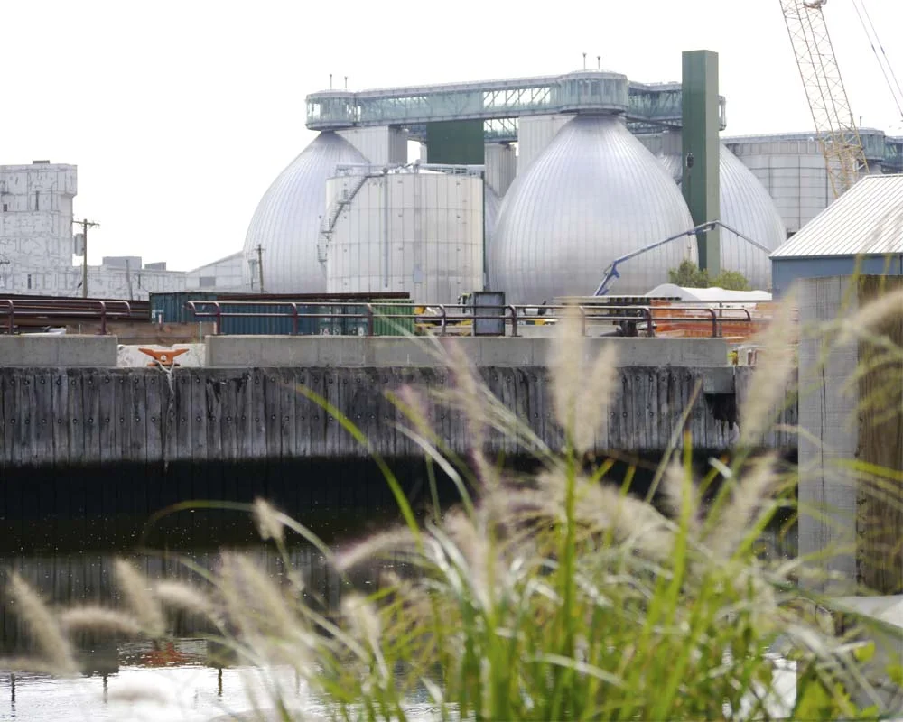
George Trakas was engaged to bring an artful approach to developing the nature walk. A distinguished artist with significant experience working in complex waterfront sites, Trakas has twice received National Endowment for the Arts Fellowships, and is a medal winner for sculpture from the American Society of Arts and Letters, which honoured his unique “vision of landscape”.
Newtown Creek Wastewater Treatment Plant is a dramatic and exciting assembly of pipes and tubes and shiny things, lit an otherwordly purple at night, and all dominated by four enormous pieces of industrial-Faberge-chic. These are the symbolic and literal centrepiece of the plant: referred to in the industry as ‘digestor eggs’ this is where the business end of sewage treatment takes place. They loom over the waterway, linked together at the top with a glass-walled walkway, like a setting from Metropolis, or Gattaca, and the public applies in droves to see the eggs up close whenever the plant advertises tours.
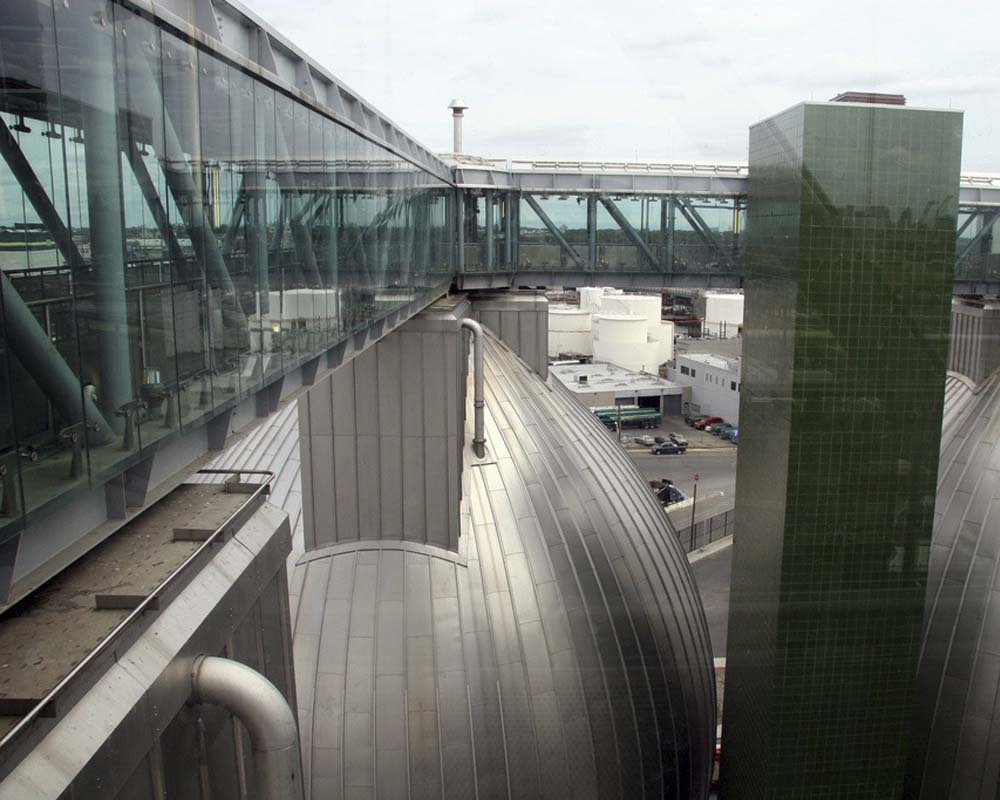
Image by joevar. Licensed under Creative Commons Attribution-NoDerivs 2.0 Generic (CC BY-ND 2.0). Retrieved from http://www.flickr.com/photos/57462257@N00/4006853382/in/photolist-775aV1-775aME-7758U7-775bso-775867-775ba3-771c1n-771eAv-771gYz-771cfX-771eVX-7758p9-771dFX
If the treatment plant looks like a vision from the future, the park opposite references a time past, one where Newtown Creek flowed fresh and clear, as it did when the indigenous Lenape people made their home here. Trakas’s artwork is multilayered and comprehensive. Particular plant species were chosen for their cultural or historic significance, which is relayed on small plaques.

Other interpretive signage informs visitors that rubbish bins are made in the shape of old water barrels, steps down to the water reference geological epochs...

...as do rocks placed amongst the planting.

Newtown Creek Nature Walk is tough and robust, like the gritty waterfront precinct it fronts. Yes, there are some trees in place now, but the overwhelming view is of industry: big barges with cranes on them moving crushed up metal onto smaller barges with old tyres round their waterlines; big light towers, the undersides of big bridges, big billboards, big warehouse buildings - everything big and muscular.

The detailing of the Nature Walk responds to this muscularity, with big concrete steps, sheet piling and massive bench seats.
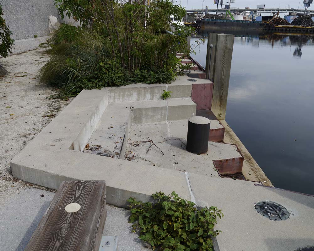
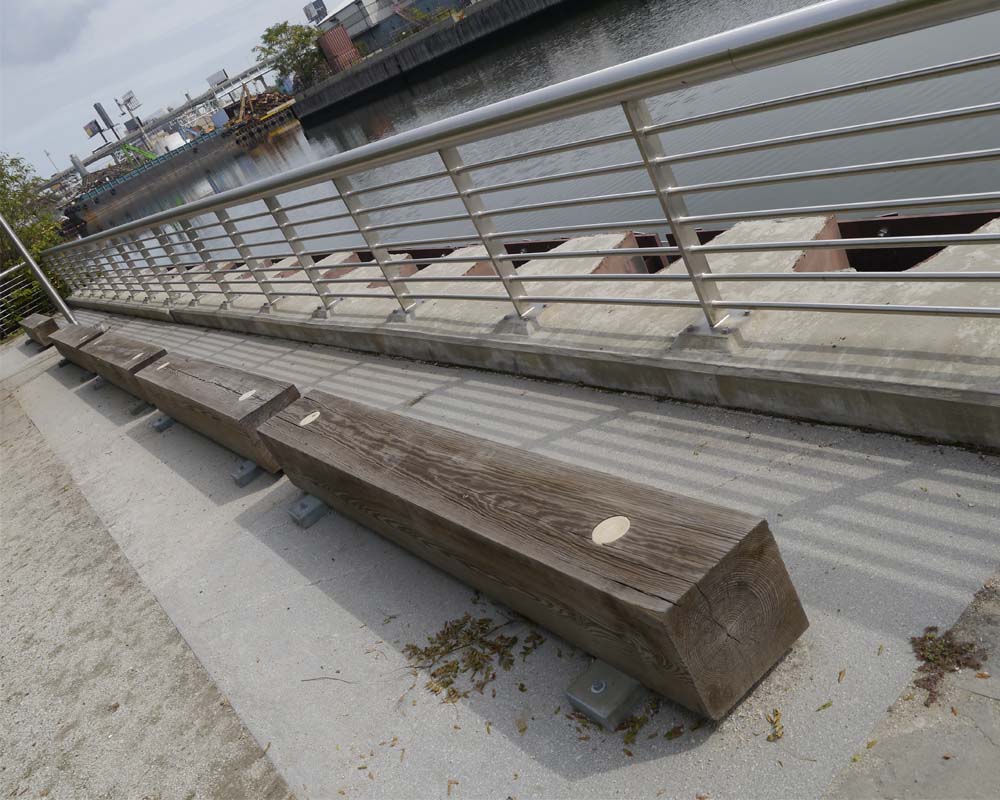
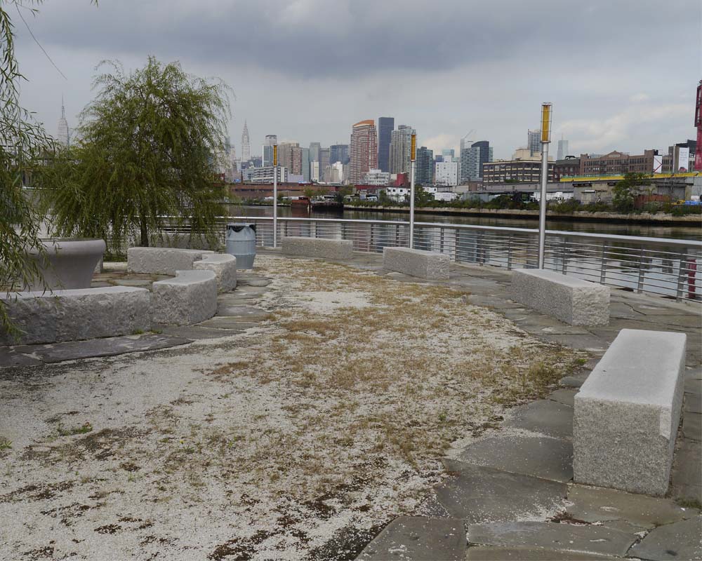
Within this tough exoskeleton, moments of delight are to be found. A circular gathering point invites groups to stop by the edge...
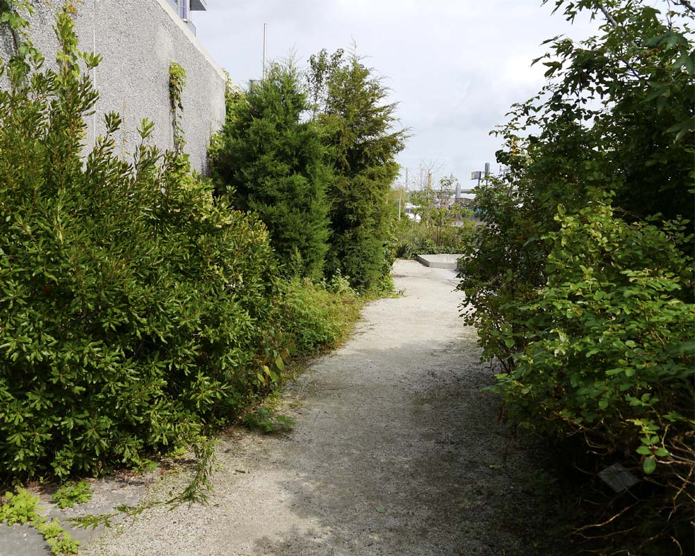
...planting creates tall green tunnels...
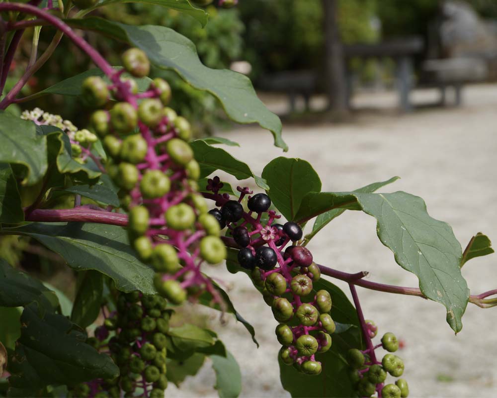
...and flowers and foliage appear more brilliant against the grey stone and concrete.
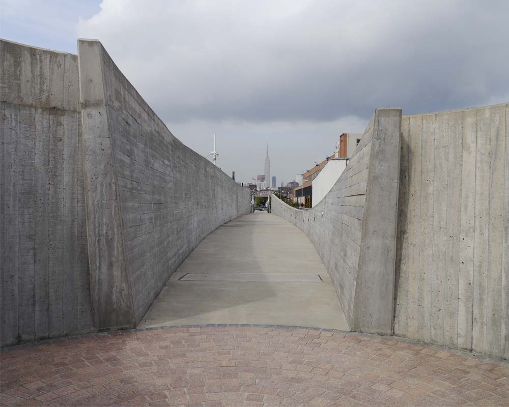
Retracing their path to the entry visitors pass through the swollen concrete walls of George Trakas’s 51 metre-long Vessel. Holes punched through the walls allow glimpses of the mechanical equipment and processes going on behind. The view straight down the centre of Vessel aligns with the Empire State Building, seemingly a world away from the unexpected tranquillity of this park-like space next to the sewage treatment plant.
Now it’s over to you.
What do you think of the idea of public parkland in such an unusual location? Do you think the artistic overlay has resulted in a more engaging space? Leave a comment below letting me know.
If you know someone who’d enjoy reading this article be sure to share it, and check back soon for more from the wonderful world of parks, gardens and landscapes.
Details
This article is an edited extract from my book Future Park: imagining tomorrow’s urban parks, released this September by CSIRO Publishing.
The Newtown Creek Alliance is a "community-based organisation dedicated to restoring, revealing, and revitalising Newtown Creek".
The Visitor Centre at the Newtown Creek Wastewater Treatment Plant is open by appointment.
The Treatment Plant was open as a part of Open House New York 2012. Listings for OHNY 2013 will be released at the start of October.
How much do we love New Zealand, huh? If you’ve ever spent a lazy Saturday enjoying Auckland’s waterfront before the realities of winter set in, you’d be forgiven for thinking this was the slice of heaven Dave Dobbyn was singing about, not some pouty chick...or Footrot Flats. (Go on, listen to it. Nothing better than a bit of da-da-da to put you in a good mood)
I enjoyed just such a day in mid-April, at the end of the brilliant IFLA landscape conference and Gibbs Farm sculpture park field trip. Judging from the crowds, about half of Auckland had the same idea.
Auckland has one of the kick-ass-est harbours in the whole world, and sailing seems to be a compulsory activity. Boats from all round the globe cosy up to each other in the berths. Just how sassy is Janice of Wyoming?

You can easily walk to the waterfront from the downtown area. If you’re coming from further afield the main Britomart train and bus station is just on the water’s edge. And if you’re heading for one of the harbour islands, this is the place to catch the ferry.
Auckland city was born at the waterfront in 1840. For a long time before that, the harbour was a vital, sacred part of Maori life. In recent years, spurred by hosting the 2000 America’s Cup and the 2011 Rugby World Cup, the working harbour has been gradually inviting the public back in. You can read more about the redevelopment, including the different precincts (Wynyard Quarter, North Wharf, Karanga Plaza, Silo Park and more) on the Waterfront Auckland website.
Here are my favourite moments:
1. Lay out the Welcome Mat
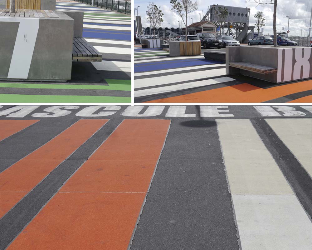
This supergraphic barcode helps pedestrians navigate two carparks connected by an operating bascule bridge on their way to Wynyard Quarter.
2. Pop-up Library
Here, another welcome mat is laid out. This time it’s artificial turf that marks a little gathering spot in front of a shipping container library. Lilliputian furniture can be moved around to suit the sun.

3. Containers
Why stop at just one. The information kiosk deftly stacks containers into a sculptural heap to anchor one corner of Karanga Plaza. The public loos are here too, and it makes a natural backdrop for events and performances. The day I visited there was a piano in the plaza (tick!) and students played all day to advertise an upcoming concert. Special mention should also go to the superbly attired lady whose fabulous orange trousers hit just the right note beside the containers. Respect.

4. Different Types of Seats
Sometime different types of furniture can make a place look untidy and feel disjointed. That doesn’t seem to be the case here, maybe because the bridge crossings, changing path widths and varying neighbours make each of the precincts along the waterfront feel different anyway.
The seats in Karanga Plaza roll back and forth on rails. They’re also great if you and your friends can’t bear to be apart for even a moment. The seats along North Wharf look like miniature versions of the piled-up shipping containers. The seats outside the Viaduct Event Centre are bar stool height, behind a long concrete counter.

5. Oasis
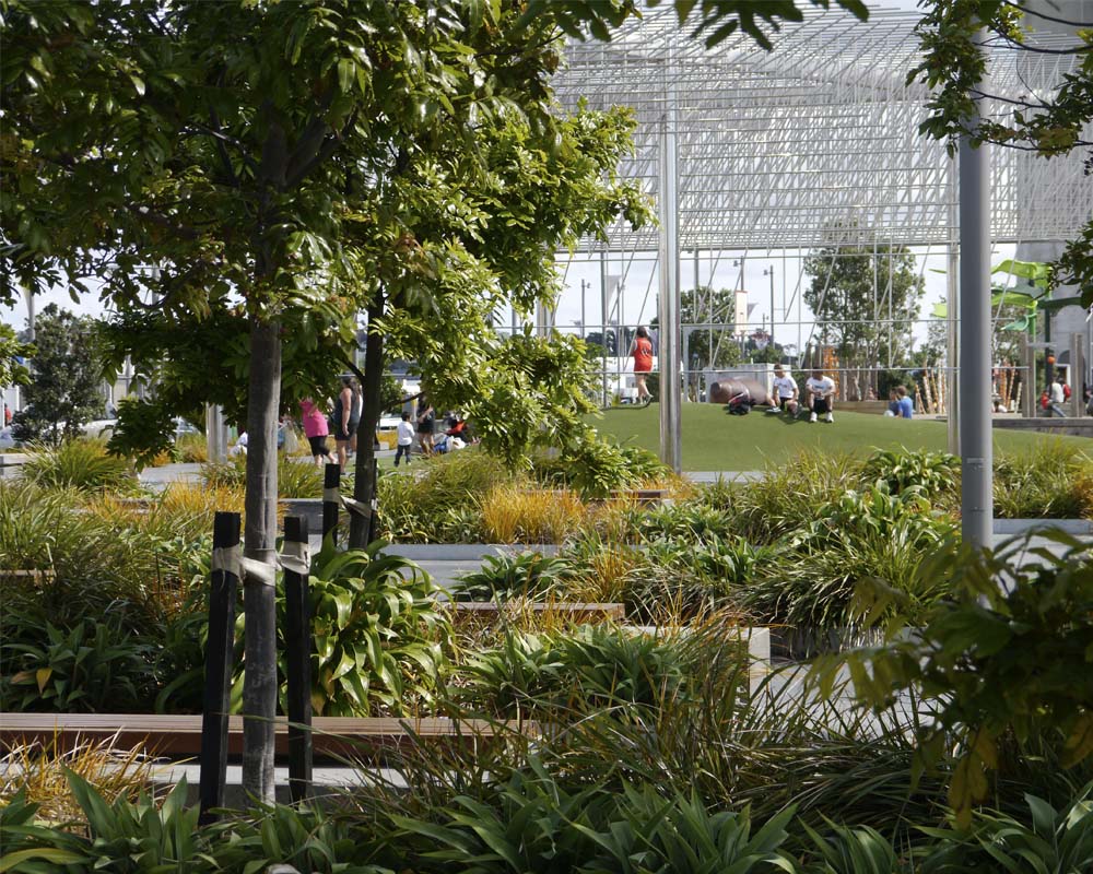
At the end of North Wharf, before it erupts into a giant playspace, is this quiet pocket with places to sit out of the hustle and bustle.
6. Playtime on Steroids
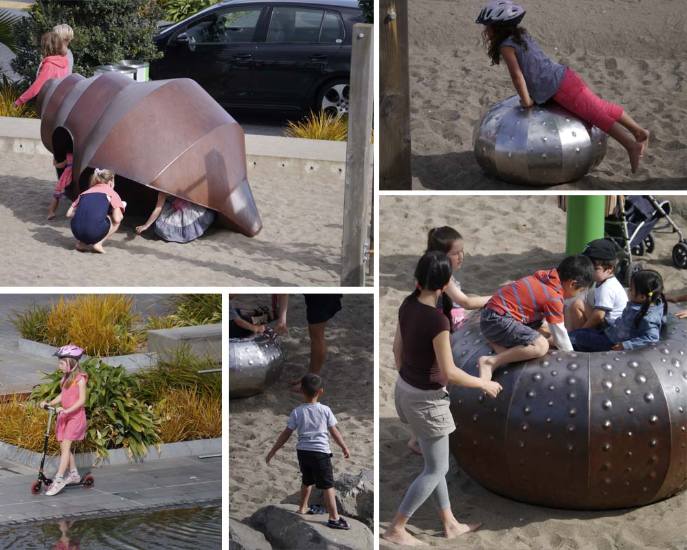
Pros: This massive wonderland of play imagines what this part of the sea was once like. Giant shells, barnacles and other creatures can be climbed over, sat on or spun around and around. There’s also nets and swingy things, a vast bed of sand and a low wall of stones for practicing clambering and balancing. At the end of the play area is the sculpture Wind Tree, relocated from its former city home to a new shallow reflecting pond. It doesn’t take much grey matter to figure out that this also attracts kids like crazy.
Cons: it’s so big because this is apparently a future development site. Let’s hope some place for play remains and it doesn’t all turn into a dreary, but revenue-generating, 9-5 office building.
7. Sexy Water Management
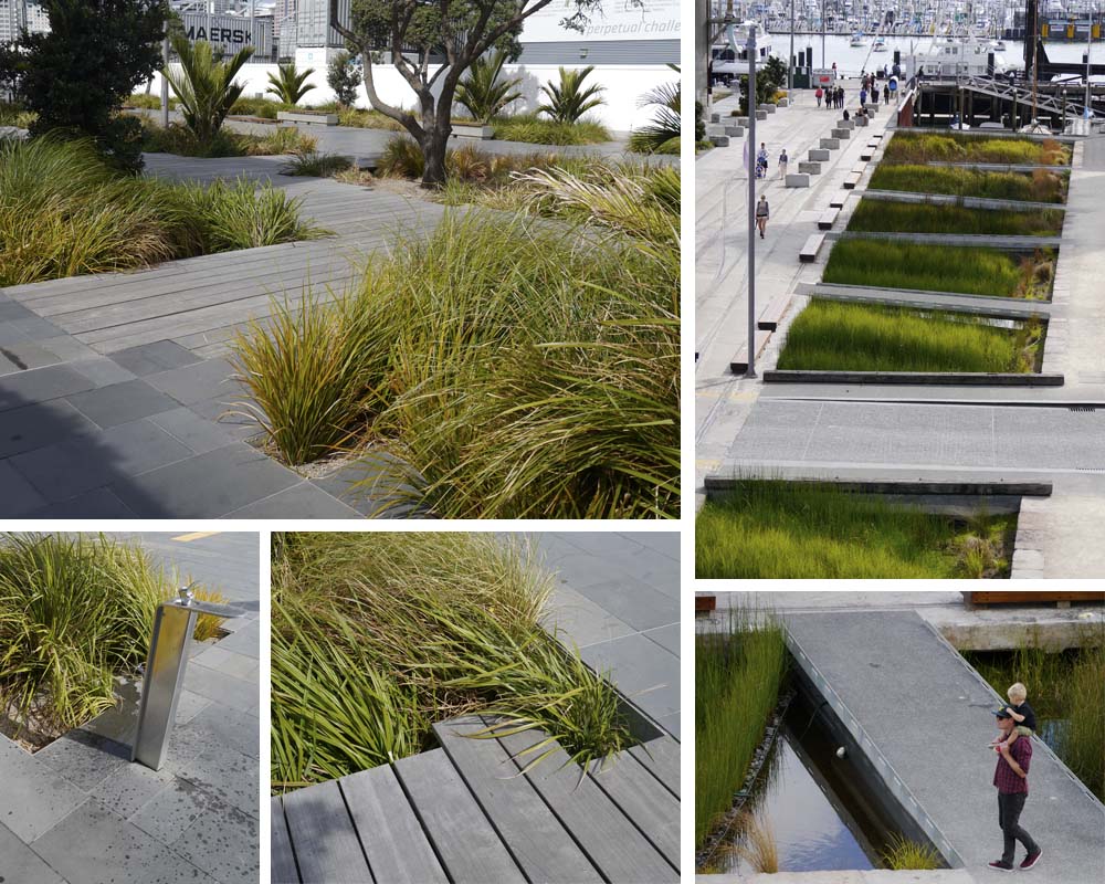
This is not just some pretty planting behind the containers, although it does look great. Look closely and you can see that the planting beds are set down below the paving. This allows water to run off into the planting where it’s filtered and cleansed before going back into the harbour.
The same thing happens at Silo Park at a much bigger scale. Stormwater runoff here is directed into a long linear channel, densely planted again, and criss-crossed with paths.
8. Working
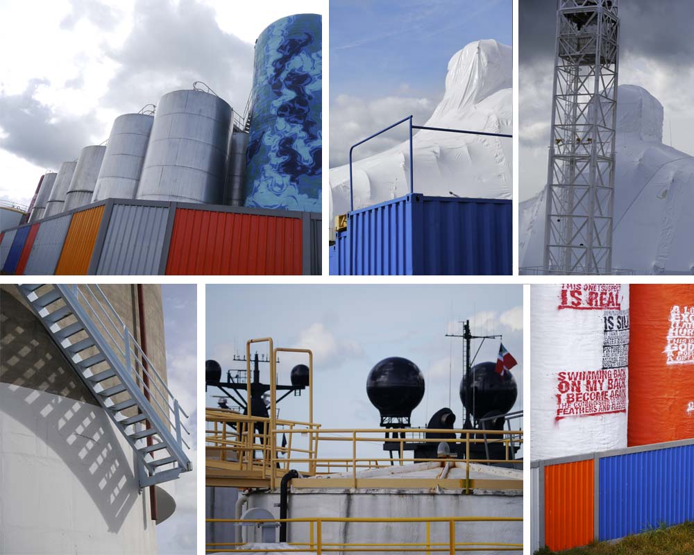
I love most about this part of Auckland’s waterfront is that it’s very much a working harbour. The navy occupies a vast land holding to the east, and there is an gigantic shrink-wrapped vessel being repaired down near Silo Park. All very cloak-and-dagger.
Whilst disused silos form the backdrop to Silo Park, the silos of the bulk storage facility dominate the scene. Some are painted and act as huge sculptural installations behind the gantry.
These sites operate around-the-clock, constantly bringing life, activity and people to the waterfront.
It’s a delicate balance, essential to get right, but for me it would be disastrous if all of this stretch of harbourfront was ‘cleaned up’ and industrial activities moved on to somewhere ‘out of sight’.
9. Gantry
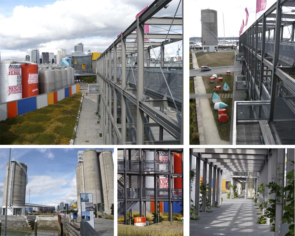
This 12m high, 110m long structure was built to 'screen' the bulk storage tanks behind. Climb to the top and you'll get a great view into this part of the harbour that I find just as interesting as the parks and promenades, maybe more so.
It also reveals long views back towards the city, and along the entire waterfront public places, and is a perfect spot to watch life unfold.
10. Weddings, Parties, Anything
The waterfront is a go-to place for quality Auckland people-watching and overheard conversations:
“I never knew this place was ****ing here, bro.”
“I know, bro.”
In just a few hours I saw plenty of tourists, but also locals who’d come down for a function, a wedding party having photographs taken, kids riding bikes, people running and exercising, those who’d brought their lunch with them, those who were headed for a restaurant, and those who were lining up for a pie or a coffee or a smoothie to have while sprawling at the picnic tables or on the lawn. Little kids were in the playground, bigger kids were at the basketball court. The temporary summertime stalls were busy and the summer movie nights were still being advertised. Students lounged, couples canoodled, and the blue sky hung on as long as it could overhead.
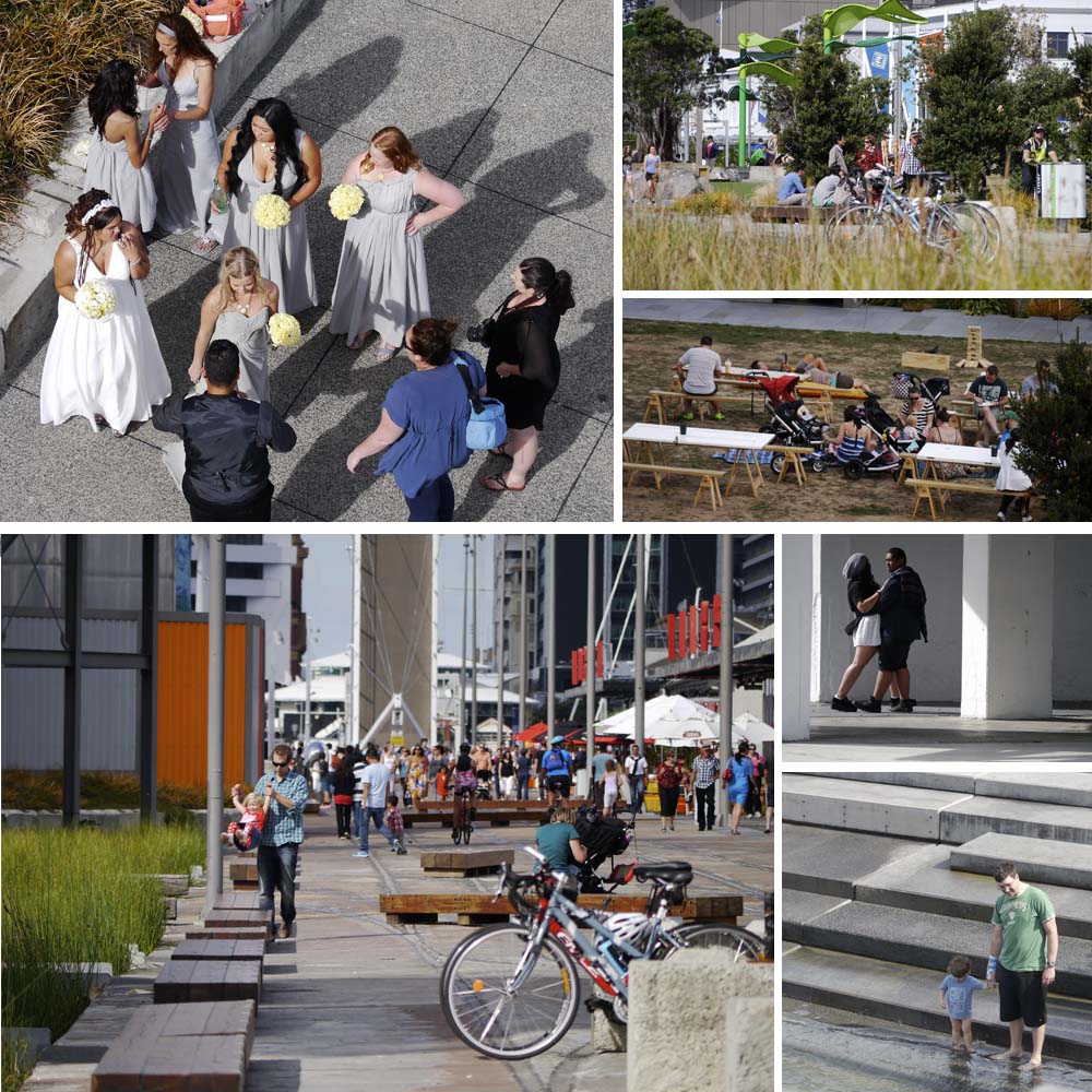
And that’s the secret to great public space – enabling all different types of people feel welcome.
What do you think? If you’ve visited the Auckland Waterfront recently how did you find it? Leave a comment below letting me know what you liked best.
If you know someone who’d enjoy reading this article be sure to share it, and check back soon for more from the wonderful world of parks, gardens and landscapes.
Can you guess where this wall might be?
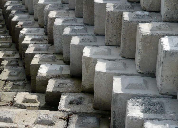
How about this one?
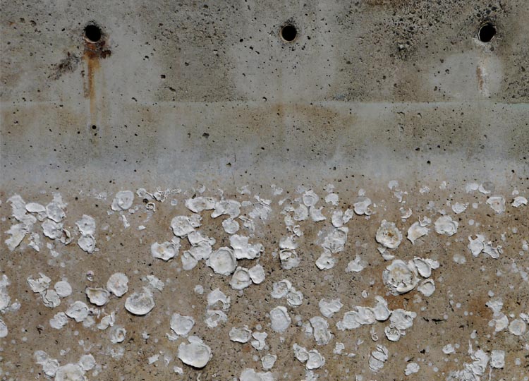
Even in close-up, these walls are starting to tell stories.
Stories about their location, about their history and about the conditions they experience every day.
It’s a bit of a no-brainer really, once you start looking properly, to tell that these walls are near the waterfront. Both can be found in the ever-increasing necklace of public places fronting Auckland’s famous harbour.
Let’s start with those oyster walls. They’re part of a massive temporary, playspace in Wynyard Quarter. The whole design by Isthmus imagines a waterfront that might lie beneath the existing ground, and the walls help tell that story.
On fine sunny days big kids and small were all over it like you wouldn’t believe. From a distance the shells in the walls can’t be seen, but then the scale, mass and colour of the concrete takes over the job of telling the story.
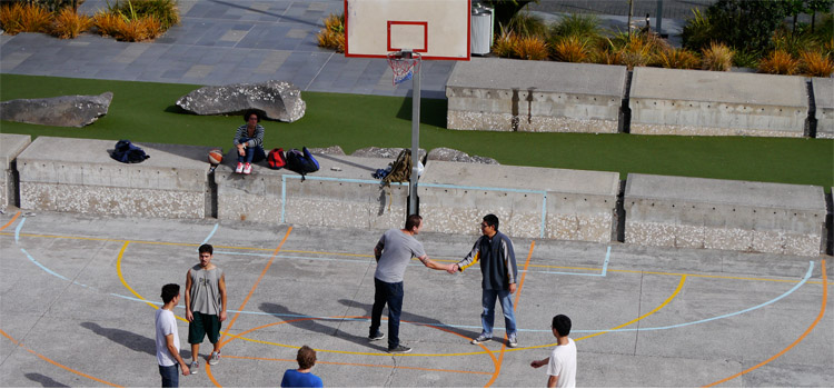
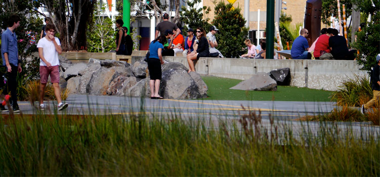
The other wall is part of a revetment wall near the end of Silo Park that tumbles down to the water. It’s the daily tides that have painted it in such beautiful graduating hues.
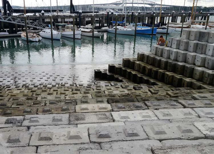
The wall acts as a mini amphitheatre, with everyone walking past able to look down and see you. Despite this the change of level creates a surprisingly private and secluded nook (a nookie nook for this pair...) away from the main promenade and activities.

These blocks that make up this wall have been recycled by Taylor Cullity Leathlean | Wraight + Associates from old precast concrete units that were once used for storage.
I love the stories embedded in landscapes, and the connection they create between the past, present and future.
We are working on a project at the moment that will make walls using existing paving that we're removing to create better level transitions. Doing this creates a win-win: we solve the challenging Once built, these walls will then become another chapter in the story of this landscape.
Examples like this are everywhere if we take the time to look. Where have you encountered walls that tell a story? How could you adopt this approach to tell a story in your landscape? Let me know in the comments below.
And if you enjoyed this taste of Auckland’s waterfront landscape then stay tuned, as I’ll be sharing more in the next few weeks.