Parque del Agua: the gift of water

What could be more welcome on a hot, sticky day than a cool, shady park?

Not much, I reckon, unless it’s a cool, shady park that sells ice cream.

With that in mind, welcome to Parque del Agua – ‘Water Park’ – in Bucaramanga, Colombia.

Visiting Bucaramanga involves landing at Palonegra airport. And landing at Palonegra airport involves descending at rapid speed towards a runway that seems to be perched on top of the steepest mountain in South America. Until the moment you actually hit the tarmac, all that is visible out the airplane windows are similarly towering mountains all around, and the sheer drop below.

It’s worth it though, because this is a ripper of a park.

It sits on a corner site, roughly D-shaped, and the ground rises steeply up 20 metres from the bounding streets.

Glimpsed views of the surrounding streets.

Glimpsed views of the surrounding streets.

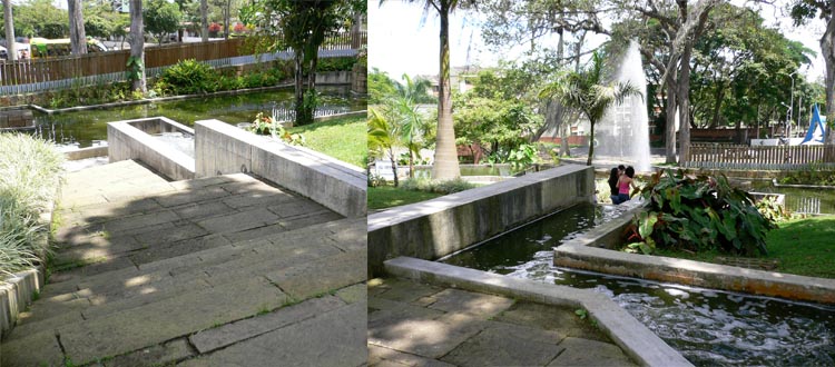
Stone steps and ramping pathways negotiate the sloping terrain.

Stone steps and ramping pathways negotiate the sloping terrain.

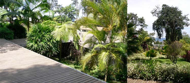
Inside, angled stone paths wrap around the curving part of the ‘D’, and are joined at the top of the hill by a long timber deck.

Landscapology_Agua6.jpg
Landscapology_Agua7.jpg

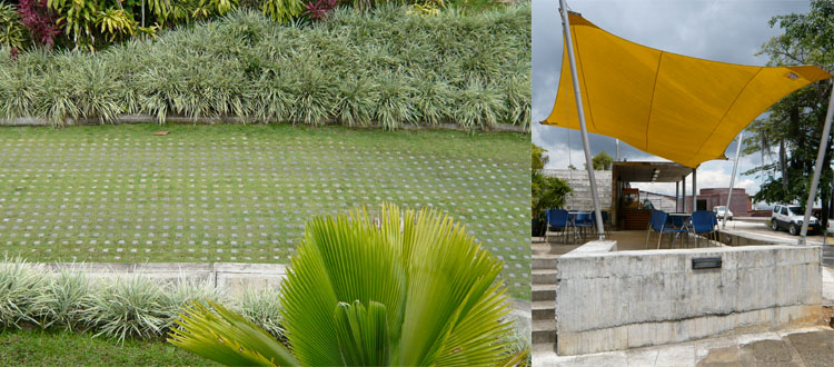
The planting is lush and luxuriant, with foliage plants, climbers, and flowering tropical species.

Existing mature trees on the site were incorporated into the planting design.

Existing mature trees on the site were incorporated into the planting design.

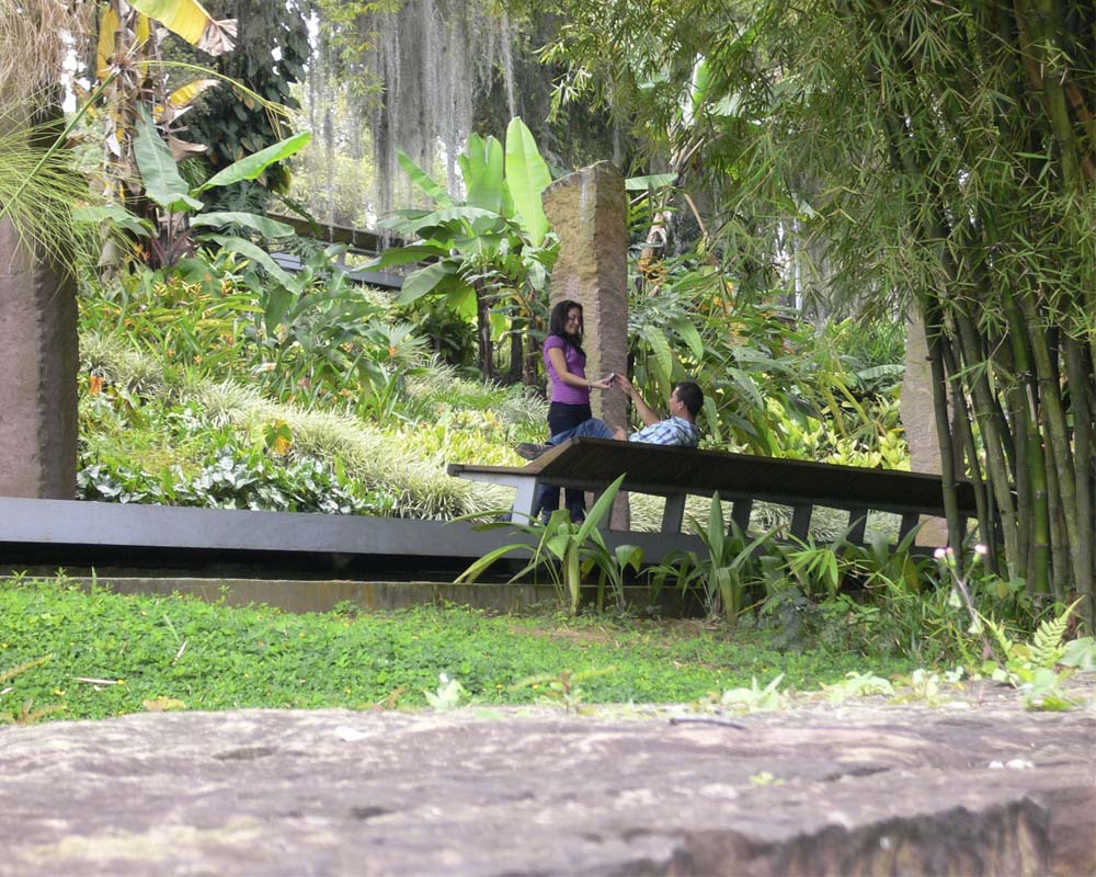
A towering bamboo canopy arches over the timber deck, shading an equally long bench seat, and directing attention to a series of stone pillars standing between steep cascades.

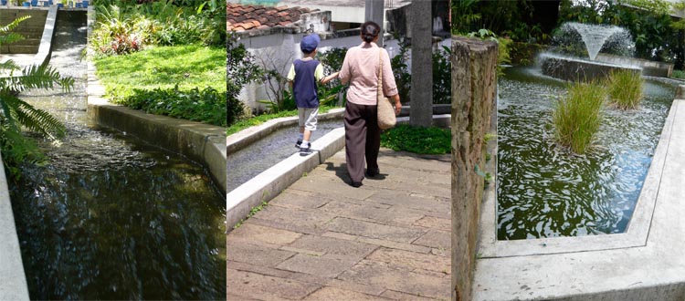
Water is the real star here. From the top of the hill it splashes, pulses, sprays and rushes to the bottom, stopping only to fan out in wide, flat pools. The sound of water is everywhere too, quieting the outside traffic and allowing groups to converse without being overheard.

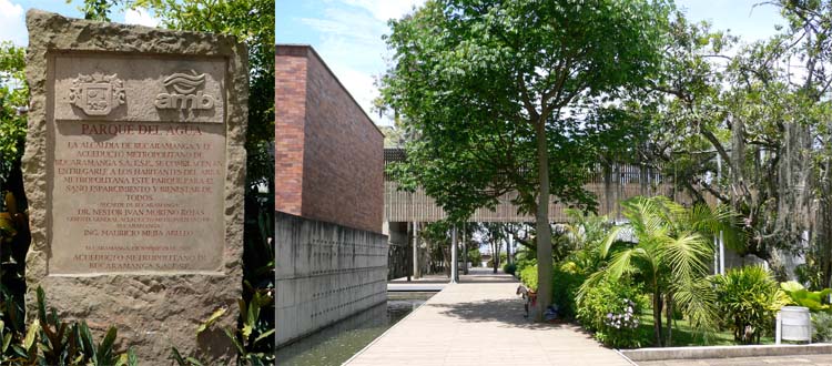
Water is also the surprise at Parque del Agua. Why? Because this is a park owned and operated by the local water treatment authority. The Acueducto Metropolitano de Bucaramanga (AMB), is also headquartered here.

The AMB headquarters buildings also step down the sloping site, joined by aerial walkways that shade the paths below.

The AMB headquarters buildings also step down the sloping site, joined by aerial walkways that shade the paths below.

At its establishment in 1916 the AMB was charged with supplying water to Bucaramanga and two other nearby towns.  As demand grew so did the need for additional facilities, which the AMB developed and operated until 1975, when it was bought by the local council. 

From its early days the primary water treatment plant was located here at Morrorico, on the eastern fringe of the city.  The actual treatment facility occupied only a small portion of the large land-holding, and local residents became used to enjoying the spontaneous tropical landscape and lawns of the park-like grounds. 

Expansion of the plant reduced the amount of land available, and after the council buy-out a shared company took responsibility for water treatment and supply.  Public use of the land dwindled and the once vibrant community gathering place became neglected. 

Fast-forward to 2001, when AMB Manager Victor Azuero Diaz proposed moving the company’s  administrative functions back to Morrorico.  With the support of the Mayor a park was proposed for the site, in homage to the former public appropriation of the land for recreation. 

When you understand this, the water really makes sense. The two ways water is used in the park (fast-flowing and still pools) reflects the way it is used in water treatment engineering.

The brightly coloured animal artworks on the wall (left) are illuminated at night, and supplemented at Christmas by other installations throughout the park, drawing big crowds. The Planning Department (right) enjoys prime position in the centre of t…

The brightly coloured animal artworks on the wall (left) are illuminated at night, and supplemented at Christmas by other installations throughout the park, drawing big crowds. The Planning Department (right) enjoys prime position in the centre of the park.

Although the administration of the system is the main activity, functional run-off tanks still operate on the site.  Where the park could undoubtedly go further is in pushing its abundant planting and water to be more than just ornamental.  As well as creating a welcoming cool environment for visitors, how marvellous would it be if they actively showed how rainwater could be detained and slowly released to reduce local flooding, or how biological treatment could help cleanse of water prior to its release back into the catchment, both worthwhile exercises in a tropical environment. 

Although in Brisbane we would probably call these missed opportunities, we should not underestimate the success of Parque del Agua. It is well constructed, with inventive use of just a few materials: stone, gravel, concrete and timber.

It’s a well-loved, well-patronised local landmark, with a lot to teach us about the ways land associated with a municipal utility authority can be effectively made available for public use and enjoyment. And on a hot, sticky day, it sells ice cream!


Now it’s over to you.

What did you think of Parque del Agua? Do you think more of our public utilities and authorities should be trying to ‘give back’ to their customers and communities in such a way? Let me know in the comments below.

And don’t forget, sharing is caring, so if you know someone else who might find this interesting, why not share it.

See you soon for more garden, landscape and design stories.


Note: Parque del Agua was designed by Lorenzo Castro, Michelle Cescas, Alfonso Leyva and Geman Samper. It is located at the corner of Carrera 34 and Calle 20, Bucaramanga, Santander, Colombia. Find out more about the history and opening hours at the AMB website (in Spanish).

This project is included in the chapter on Co-location Parks in Future Park.

Your Favourite Stories of 2013

It’s hard to believe the Landscapology blog has been up and running for six months now. In that time the number of people receiving weekly updates has more than doubled - thank-you for your interest and support! So as the year draws to a close, let’s take a look back at the stories that resonated most with our regular readers.

Here’s the Top 10:

10.  A Celebration of Texture: sometimes the bumpy bits are the most interesting - our small selection of beautifully textured pavements, walls, walls, artworks and plants.

9.  Design Class: make analysis your friend - the first of two simple guides to basics to looks out for and understand before you start designing.

8.  Elephants never forget...and they can teach you how to read drawings - Trunky the Elephant's Design 101 guide to understanding plans, elevations and sections.

7.  How I visited a park in Colombia and ended up with a book deal - as Future Park went to print I explained how the whole project came to be.

6.  Visit Landscapology at Brisbane Open House - a sneak peek inviting people to visit the new studio. The follow up story of the day was also popular.

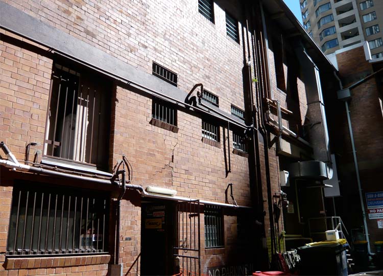
5.  Back of House - celebrating the delights of the tangled, messy, not-for-public-view backs of our city buildings.

4.  Is the frangipani Brisbane’s favourite summer tree? - the answer was a resounding yes! And this story was a tie for fourth place, with...

4.  Landscapology’s 2013 Christmas Book Guide - last week's list of the books that have brought faraway landscapes closer to me this year.

3.  Serenity...in the least likely location - our tour through delightful Newtown Creek Nature Walk, next door to New York's biggest sewage treatment plant.

2. Big Prawn...yawn: THIS sculpture park features the biggest from the world's best - our visit to the amazing Gibbs Farm Sculpture Park outside Auckland.

1.  Confessions of a sell-out: Future Park is launched! - my opportunity to thank everyone who has supported me along the long and sometimes rocky road to bring my book from dream to reality.


But now it’s over to you.

What’s been your favourite story this year and why? What would you like to see more of in 2014?

I’d love to know – please drop me a line in the comments below, or send me an email.


Of course if you know anyone who’d enjoy this article, please feel free to share. And if you've been sent this by a friend, consider signing up to receive a new design tip, feature project or Landscapology update in your inbox each week.

Stop by again next week when there will be more from the wonderful world of landscape, architecture and design.


All images © Amalie Wright, except Future Park launch photo, by Nicole Phillips.

Zollverein: the World's Most Beautiful Colliery

Last week the 2013 Think Brick awards were announced.

Brick has been undergoing somewhat of a renaissance here amongst designers. Perhaps it’s a simple case of today’s generation of architects discovering and appreciating the many super stylin’ brick houses created by great Australian architects at the peak of their game in the 1960s and 70s. (Treat yourself to a flick through Living and Partly Living if you need refreshing or convincing).

Whatever the reason, brick is suddenly ‘in’ again.

All this thinking about brick got me musing about the astonishing collection of buildings that make up the Zollverein World Heritage Site in Essen, Germany.

Essen is in the country’s central far west, part of the Emscher and Ruhr valleys that were the epicenter of Germany industrialisation.

Fuelled by extensive coal deposits, the collieries and steelworks of the region were critical to wartime armament production, and then to the post-war economic boom of the 1950s and 60s.  As settlements and people followed industry and employment, this became the most densely populated area in the Ruhr valley.

Zollverein was established in 1847, when Franz Haniel bought and amalgamated 14 coalfields north of Essen. By the late 1920s the Haniel family company had been through several mergers, eventually becoming part of the largest steel group in Europe.

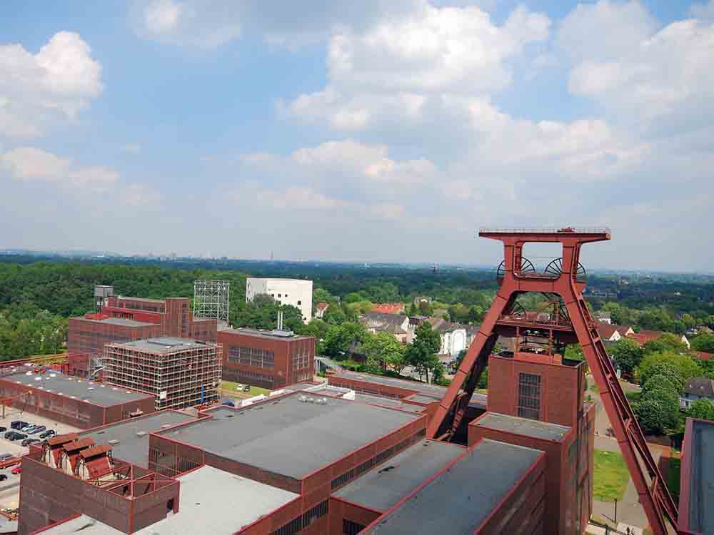
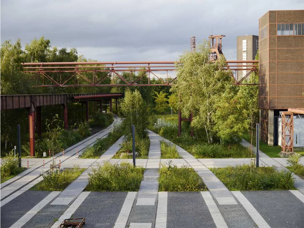
Looking across part of the complex at Zollverein.

As tends to happen in these situations, hugely ambitious production and cost saving goals were set for Zollverein, and the plant underwent a major redevelopment.

Here’s where it starts to get interesting

Architects Fritz Schupp and Martin Kremmer were engaged to design all the above-ground structures.  Yes, even though the company was pursuing cost savings. Brilliant!

Working closely with the mine’s engineers, Schupp and Kremmer replanned the site, with a ‘production axis’ and an ‘energy axis’ intersecting at a large court in front of the main shaft building and pithead. 

The functions of the site also influenced the architectural design. A system of steel framed structures, with brick and glass weather screens, was developed for the pit buildings, which, despite their different functions, all had to provide long clear spans and bear heavy vertical loads. 

A refined and austere collection of steel framed and brick clad buildings was the result. 

Adapting this system to each building gave a strong sense of order to to the site.

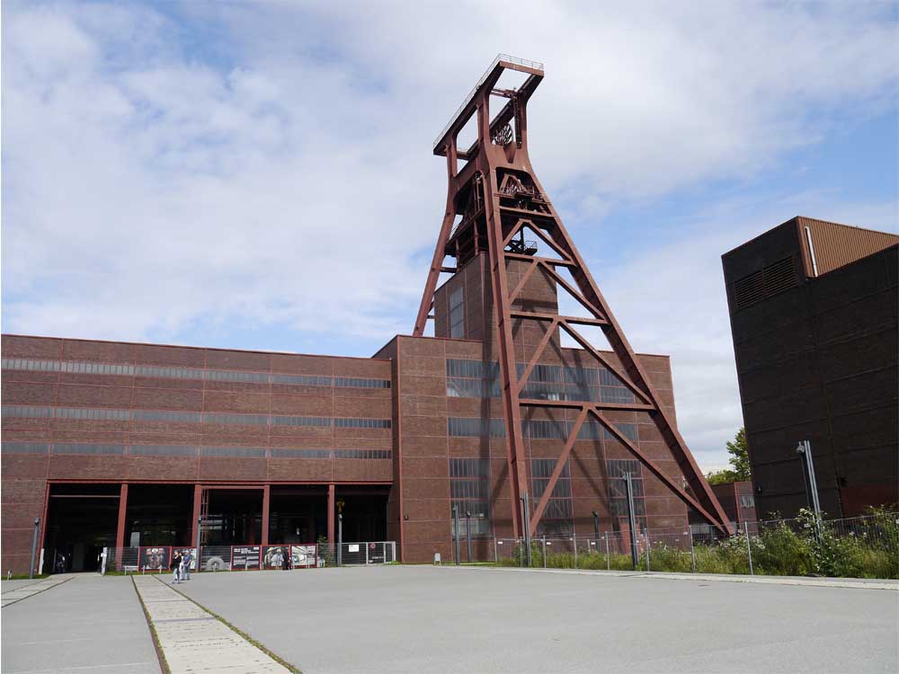
Contrasting the simple cubic forms was the mighty pit head itself, expressed in an open steel structure of great elegance. 

When the new Zollverein opened in 1932 it quickly earned the title of ‘The Most Beautiful Colliery in The World’. I think that was a pretty fair call.

In the 1970s Germany started to become less competitive in the global coal market.  By the late-1980s it was all over: mines, smelters, refineries, coking plants and blast furnaces all closed their doors and were silent. The last shift went down the Zollverein pit shaft in 1986. The coking plant closed in 1993.

The owners planned to clear the site. Many others fought to save it, and at the end of 1986 the entire shaft site was heritage listed. The state of Rhine-Westphalia bought the site from the city of Essen and from 1989 to 1999 it was rehabilitated and redeveloped.

Today Zollverein is the cultural and artistic centerpiece of the Ruhr region, with the 55 metre high former pit head standing sentinel over the place.

Rem Koolhaas’s office, OMA, completed a master plan for the site in 2002.  The landscape master plan was the work of Agence Ter.

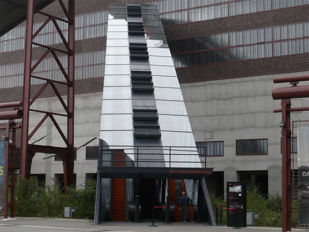
The coal washing plant, the largest building on the site, was converted into a Visitor Centre and houses the Ruhr Museum. Details in the loooong stair and escalator are inspired by flowing molten steel.

The Zollverein School of Design and Management occupies a building designed by Saanaa. Its pristine sugarcube form is inspired by the existing cubic structures.

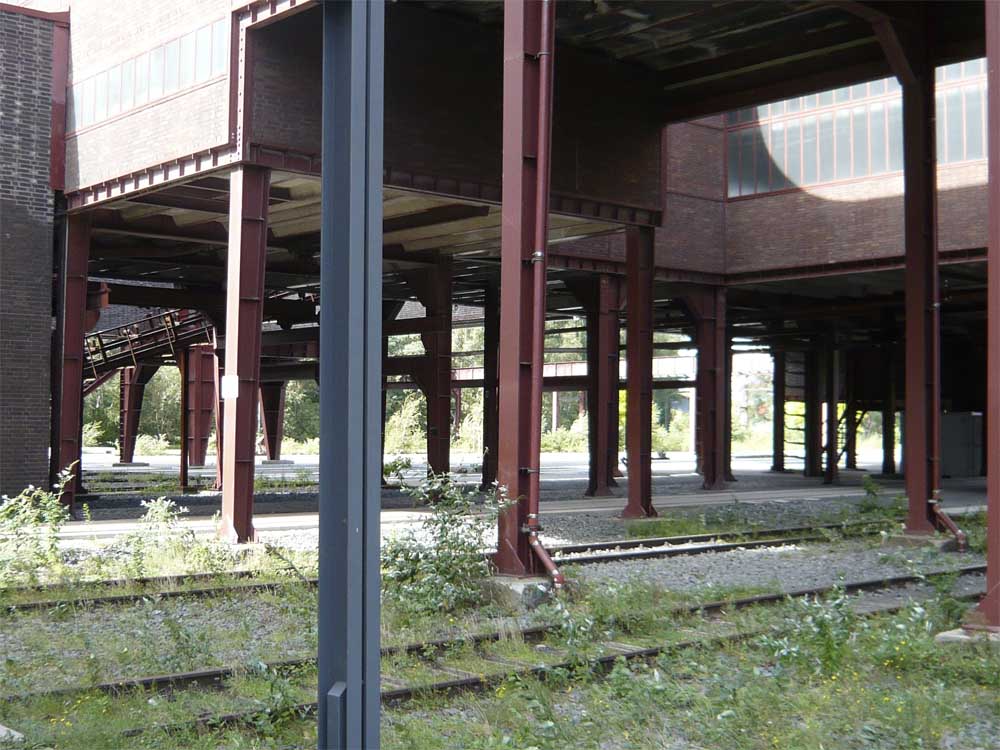
Nearby parts of the site look to have run wild.

Many of the older buildings are still off limits, awaiting their appointment with the makeover squad. 

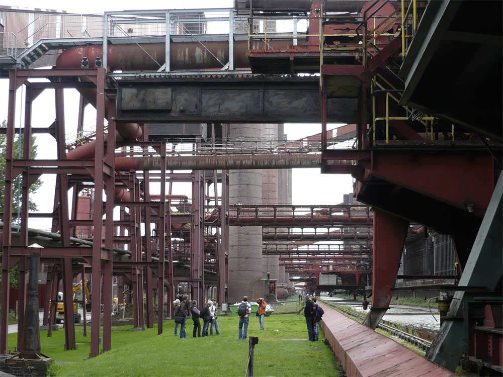
Just across the road (ie: take a packed lunch for your walk) is the former coking plant, a stupendous, 400 metre long affair trailing tentacles of pipes and gangways. 

Visitors are dwarfed by the [insert superlative of choice here] structure. 

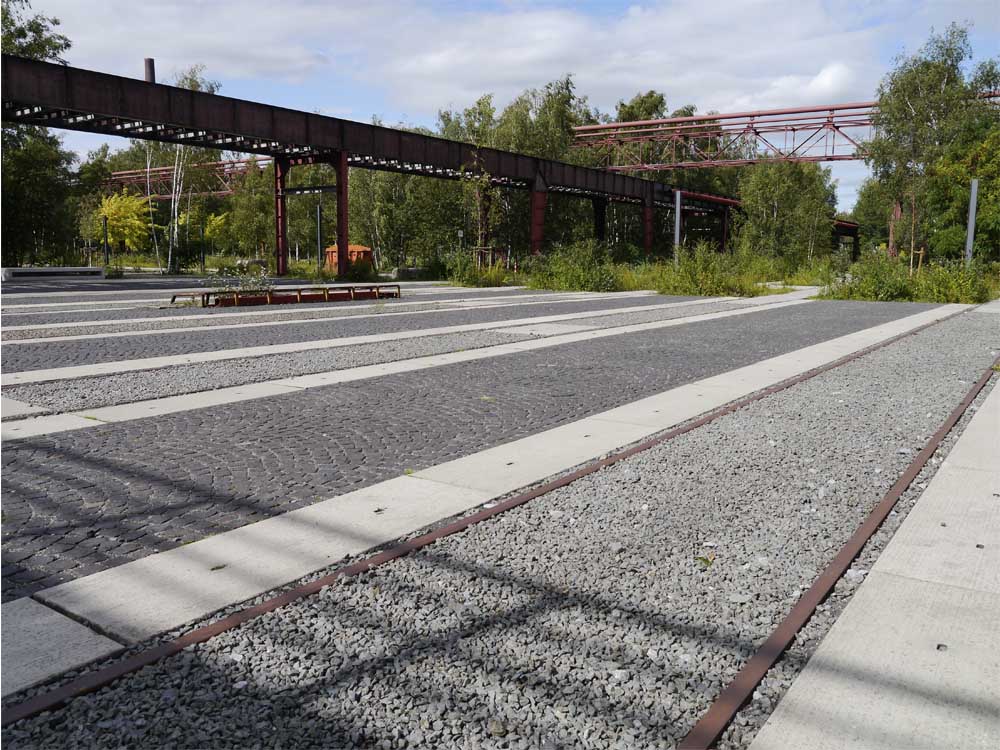
At ground level, old machinery and equipment has been replaced by a Versaille-scale water body. 

In winter there is skating! 

In summer you can take a dip in the pool... 

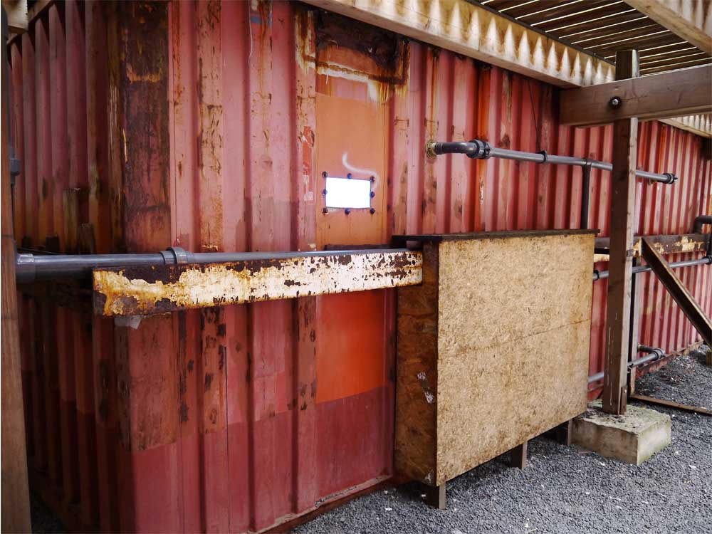
...or peek into the shipping containers holding the water below. 

The rebirth of Zollverein coincided with the International Building Exhibition Emscher Park (the IBA), a ten year state government initiative tasked with achieving the ecological, economic, and urban revitalization of the Emscher River and Ruhr Valley.

One of the IBA’s radical development philosophy was the proposal that everything from the predominantly industrial past was worth preserving.

Visiting Zollverein today doesn't just bring you face-to-face with beautiful architecture, fine landscape architecture, and evocative ruins. It reveals a hugely important site of economic production that was previously off-limits except to its workers. It shows the power of vision and commitment to work with existing redundant infrastructure, and create viable new uses. And it works not just as a stand-along monument, but as a vital, and extraordinary link in a vast regional industrial landscape.

Now it’s over to you.

What do you think of the steel, brick and glass building treatment at Zollverein? Do you think Zollverein provides any clues for how we might think about mining and industrial sites here in Australia? Are there any that have been designed as proud civic buildings, or as part of a deliberate assemblage? What are our plans for our extractive industry sites once mining finishes?

I’d love to know your thoughts – join the conversation in the comments section below.

If you know someone who’d enjoy reading this article be sure to share it, and check back soon for more from the wonderful world of landscape, architecture and design.


Image credits:

Aerial view showing pit head and Saanaa building beyond

Image by Victor Bayon

File licensed under Creative Commons Attribution-NonCommercial-ShareAlike 2.0 Generic (CC BY-NC-SA 2.0)

Image retrieved from http://www.flickr.com/photos/formalfallacy/3641897195/sizes/l/in/photolist-6xPF9X-6xPfHt-6xPg5x-6xTPCN-6xT5nq-6xTPaL-6xT4JQ-6xPdAx-8yeLeV-8yeLJR-8yhNNy-8yhQ19-8yhQKN-8yhQpN-8yhN25-cqAaWm-9BbSDL-9BbR9u-9B8Yht-9B8YD2-5hDy4q-6y3o58-7HxSB2-5hzbNx-eAUc6r-eAUcEv-eAXky7-arKUrd-arKUEU-bkvTiK-4bumjE-7MYTn1-9saLzd-9s7MMR-9saLAG-aCaTKJ-7VKS4w-4bpqCi-8Gzqvy-8Gsvng-8GvG5Y-8GvBr5-a7krWL-5hzaXe-8rSi74-dkhf64-8rSebH-3uMKpW-3uMKNN-8EyfWg-4bq2fV/ on 10.08.13

Night skating

Image by Felix Montino

File licensed under Creative Commons Attribution 2.0 Generic (CC BY 2.0)

Image retrieved from http://www.flickr.com/photos/felixmontino/5305887665/sizes/l/in/photolist-95S4xP-gmH1L-5tKoXS-8seasf-apzPuZ-3uHgZH-9nw1ka-dRE3ZR-dKryhL-dJgCxw-6xPF9X-6xPfHt-6xPgpR-6xPg5x-6xTPCN-6xT5nq-6xTPaL-6xT4JQ-6xPdAx-8yeLeV-8yeLJR-8yhNNy-8yhQ19-8yhQKN-8yhQpN-8yhN25-cqAaWm-9BbSDL-9BbR9u-9B8Yht-9B8YD2-5hDy4q-6y3o58-6h6Q1U-7HxSB2-5hzbNx-eAUc6r-eAUcEv-eAXky7-arKUrd-arKUEU-bkvTiK-7zY15z-7zY15V-rAm9x-8MaSHK-8Gzqvy-8Gsvng-8GvG5Y-8GvBr5-a7krWL/ on 10.08.13

All other images by A. J. Wright and R. A. Buchanan.

Find out more about Zollverein:

Zollverein is located at Gelsenkirchener Straße 181, 45309 Essen, Germany. Its English-version website is currently being updated, but there is still some good basic info available. The German site is available at the same link.

How I Visited Colombia and Ended Up With a Book Deal

Remember what you were doing on the 8th of June 2008?

I was leaving Colombia, having visited Bogota (the capital), Medellin (the city you’ve seen on the news), and Bucaramanga (the city you may never have heard of, high in the mountains).

My visit to this fascinating country was possible because I’d been fortunate to win a travel bursary, awarded by the Centre for Subtropical Design here in Brisbane.

In my bursary application I'd proposed visiting Medellin, a city that had been brought to its knees by cocaine, but was fighting back with a determined vision to re-engage its people with their hometown.

A public transport system of metro, buses and cable cars was in place. New public parks and plazas had been built all across the city: high quality, well-designed places, nearly all paired with public buildings such as libraries, museums, council offices and schools.

The Orchideorama, at the Medellin Botanic Gardens

The Orchideorama, at the Medellin Botanic Gardens

Plaza de Cisneros (known also as Plaza de las Luces or Plaza de la Luz- Light Plaza) with the EPM Library in the background.

Plaza de Cisneros (known also as Plaza de las Luces or Plaza de la Luz- Light Plaza) with the EPM Library in the background.

In Medellin, parks were being used as agents of social change.

Bucaramanga was different. I wanted to visit Parque del Agua, a public park built by the local water authority on its grounds. The water treatment plant had operated here for many years, with locals using the land around as an informal park.  This eventually stopped as the plant grew, and the authority moved its headquarters into town.
 In 2001, the manager moved his operations back to the original site, and with support from the mayor, proposed a public park for the site.

Administrative and treatment functions are co-located with public parkland at the Parque del Agua.

Administrative and treatment functions are co-located with public parkland at the Parque del Agua.

The park is lush, cool, and incredibly popular.

The park is lush, cool, and incredibly popular.

In Bucaramanga, Parque del Agua showed one way to co-locate a park with another public utility.

From Colombia I travelled to the United States, where I'd arranged to meet with Friends of the High Line.  At the time, work had just begun on transforming the disused, elevated rail line into a park, but there was already a buzz about the project.

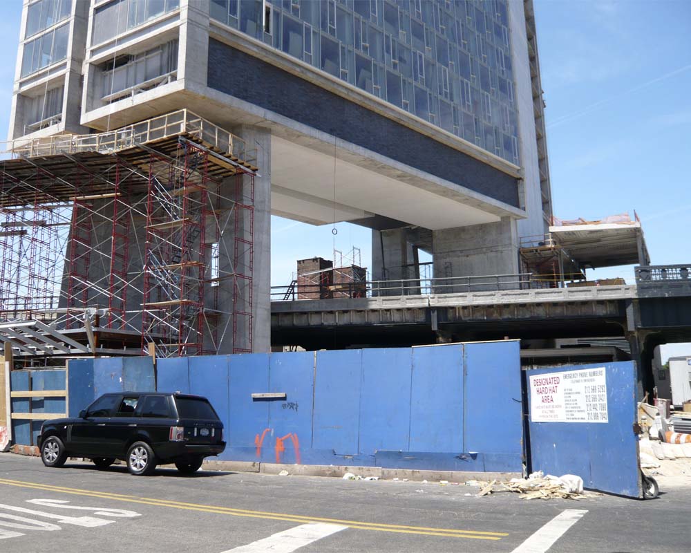
Renovating the structure of the High Line in 2008, prior to its reinvention as a park. The Standard Hotel is under construction over and above the rail line.

Renovating the structure of the High Line in 2008, prior to its reinvention as a park. The Standard Hotel is under construction over and above the rail line.
The same section of the High Line in 2010, a year after opening. The Standard had also enjoyed its first year of encouraging guests to wear robes when standing adjacent the full height windows, lest they startle park strollers below.

The same section of the High Line in 2010, a year after opening. The Standard had also enjoyed its first year of encouraging guests to wear robes when standing adjacent the full height windows, lest they startle park strollers below.

In New York, the High Line was showing how a park could link and reveal previously disconnected places.

From each of these places the germ of an idea was born.

On my return to Australia I was interviewed for ABC Radio's long-running weekly radio show, By Design. And that interview was heard by the fabulous Mr Ted Hamilton at CSIRO Publishing, who presented me with an opportunity to develop my fledgling ideas into a book.

Three years later I had visited many more inspiring parks, and read about the work of visionary designers, researchers, artists, managers, governments and communities around the world.  All of them had the courage to address the urban challenges they were facing, and to think differently about the ways public parks and people places could provide solutions.

It's been a long time coming, but finally, this week, Future Park: imagining tomorrow's urban parks has left home to be printed.

One of the hardest things has been stopping: with new, creative approaches to making city parks emerging every week, it’s been a constant temptation to include ‘just one more’.  Now, when I find projects that look interesting and relevant I share them on Twitter.

One of the most amazing things has been the encouragement and contributions of so many brilliant people.  There may just be one person tapping at the keyboard, but the human infrastructure supporting this project has been extraordinary. In particular, I had the extreme pleasure to collaborate with Nicole Phillips as my book designer.  When you see how great the final product looks, I think you'll agree that she has done a damn fine job.  It’s a cliché to say it wouldn’t have happened without all of you, but it’s true nonetheless.

So there you have it.  For everyone who has asked how it all came about…now you know!

There’s usually only one final question - now what?

The book is due for release in September.  If you’re in Brisbane, there’s going to be a launch event at Avid Reader bookstore in West End on Wednesday, 25th September. 

Come along and say hi!

Serenity...in the Least Likely Location

What’s the least likely place for a park that you can imagine?

Next to a busy freeway perhaps? On top of a rubbish dump?

How about next door to a sewage treatment plant?

The Newtown Creek Nature Walk in Brooklyn not only ekes out a sliver of public access to a contested waterfront, but brings visitors face-to-face with the biggest sewage treatment plant in New York City.

George Trakas was engaged to bring an artful approach to developing the nature walk.  A distinguished artist with significant experience working in complex waterfront sites, Trakas has twice received National Endowment for the Arts Fellowships, and is a medal winner for sculpture from the American Society of Arts and Letters, which honoured his unique “vision of landscape”.

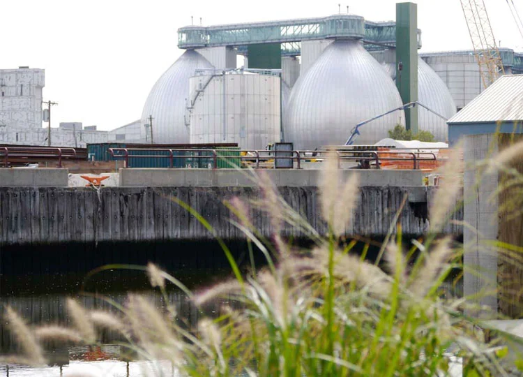
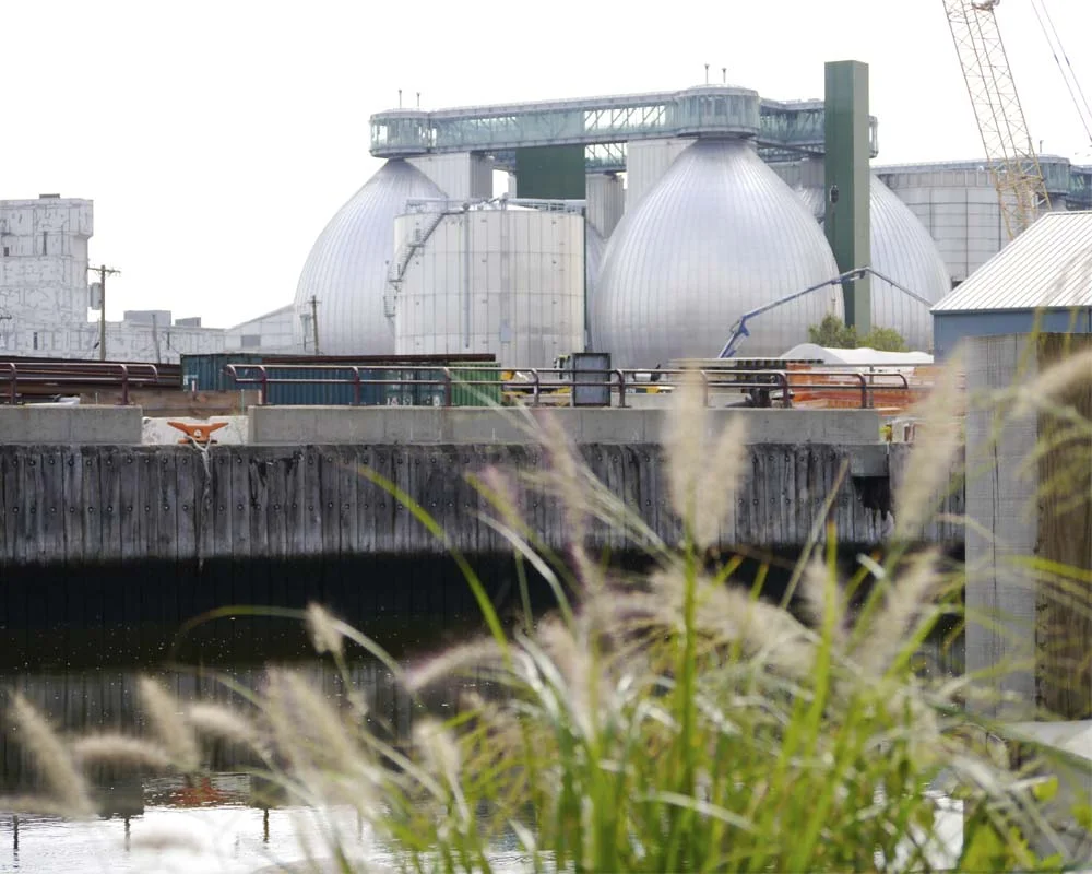
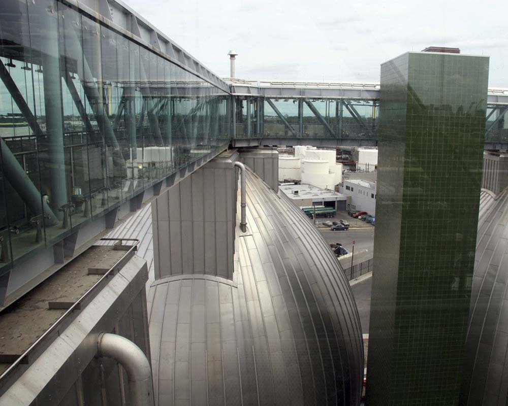
Newtown Creek Wastewater Treatment Plant is a dramatic and exciting assembly of pipes and tubes and shiny things, lit an otherwordly purple at night, and all dominated by four enormous pieces of industrial-Faberge-chic. These are the symbolic and literal centrepiece of the plant: referred to in the industry as ‘digestor eggs’ this is where the business end of sewage treatment takes place.  They loom over the waterway, linked together at the top with a glass-walled walkway, like a setting from Metropolis, or Gattaca, and the public applies in droves to see the eggs up close whenever the plant advertises tours.

Image by joevar. Licensed under Creative Commons Attribution-NoDerivs 2.0 Generic (CC BY-ND 2.0). Retrieved from http://www.flickr.com/photos/57462257@N00/4006853382/in/photolist-775aV1-775aME-7758U7-775bso-775867-775ba3-771c1n-771eAv-771gYz-77…

Image by joevar. Licensed under Creative Commons Attribution-NoDerivs 2.0 Generic (CC BY-ND 2.0). Retrieved from http://www.flickr.com/photos/57462257@N00/4006853382/in/photolist-775aV1-775aME-7758U7-775bso-775867-775ba3-771c1n-771eAv-771gYz-771cfX-771eVX-7758p9-771dFX

If the treatment plant looks like a vision from the future, the park opposite references a time past, one where Newtown Creek flowed fresh and clear, as it did when the indigenous Lenape people made their home here.  Trakas’s artwork is multilayered and comprehensive.  Particular plant species were chosen for their cultural or historic significance, which is relayed on small plaques. 

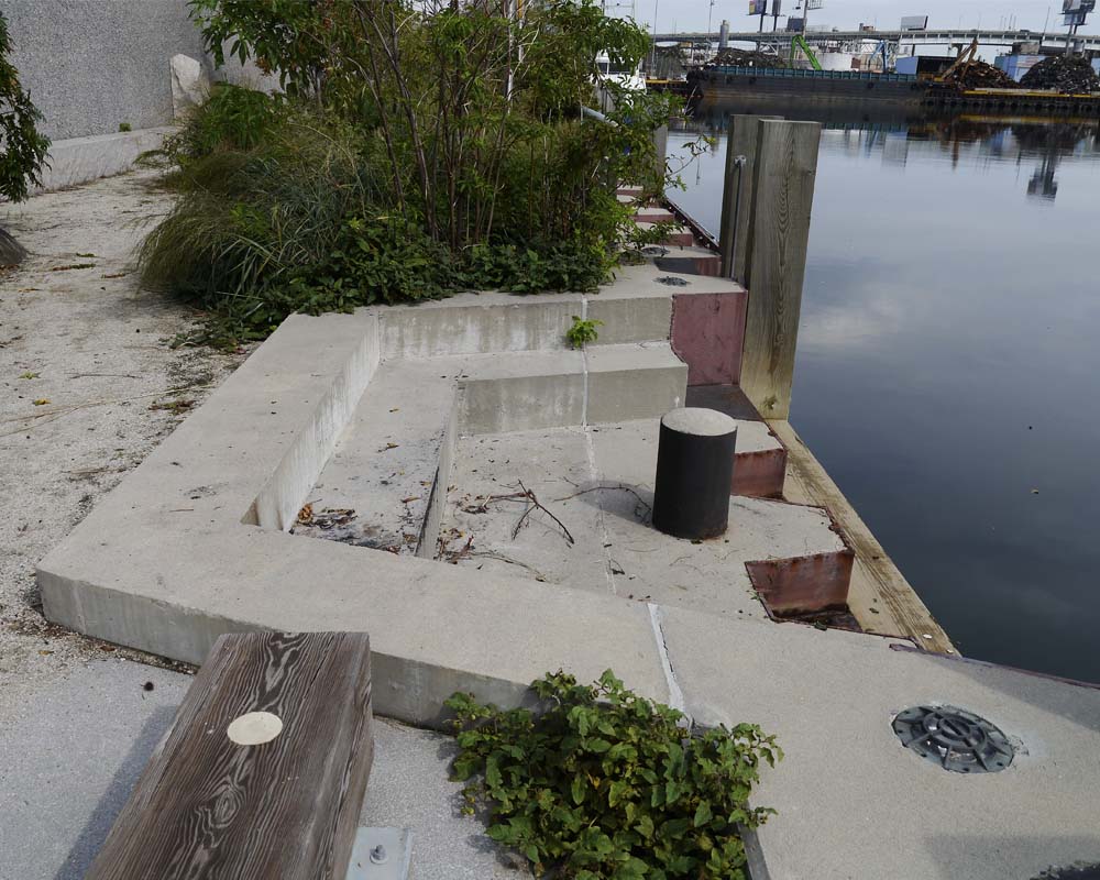
Other interpretive signage informs visitors that rubbish bins are made in the shape of old water barrels, steps down to the water reference geological epochs... 

...as do rocks placed amongst the planting.

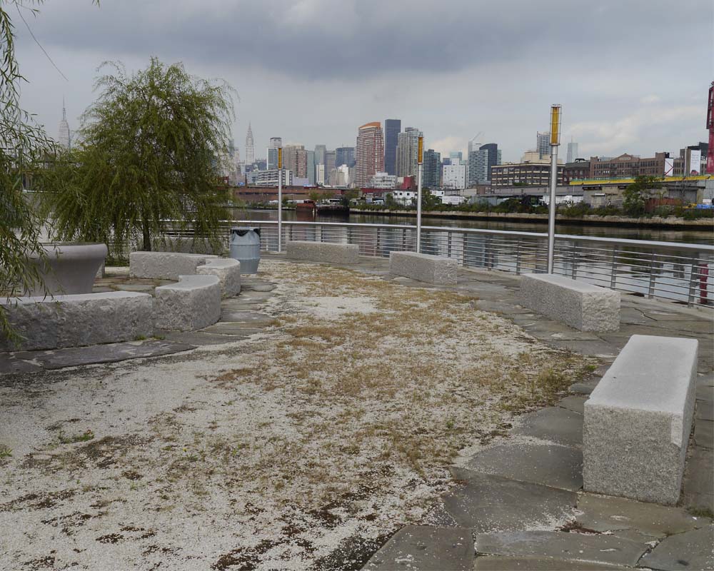
Newtown Creek Nature Walk is tough and robust, like the gritty waterfront precinct it fronts.  Yes, there are some trees in place now, but the overwhelming view is of industry:  big barges with cranes on them moving crushed up metal onto smaller barges with old tyres round their waterlines; big light towers, the undersides of big bridges, big billboards, big warehouse buildings - everything big and muscular. 

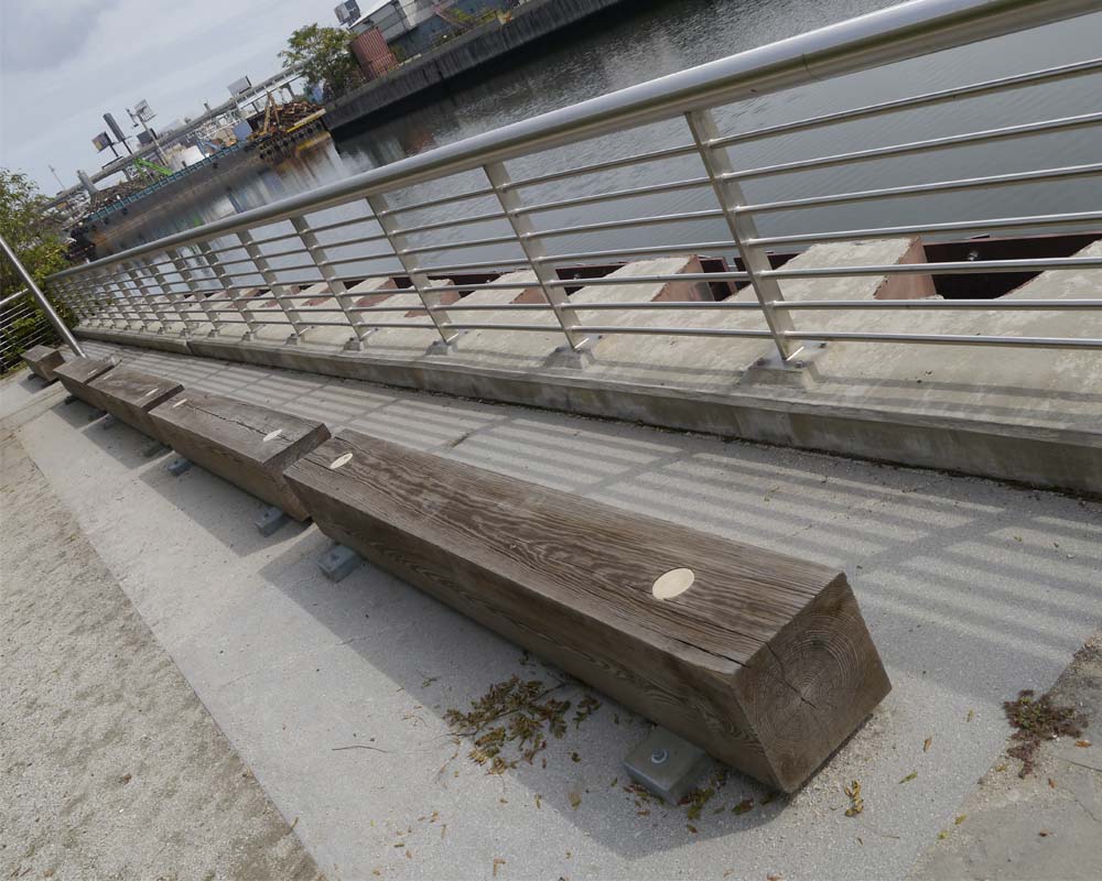
The detailing of the Nature Walk responds to this muscularity, with big concrete steps, sheet piling and massive bench seats. 

Within this tough exoskeleton, moments of delight are to be found.  A circular gathering point invites groups to stop by the edge...

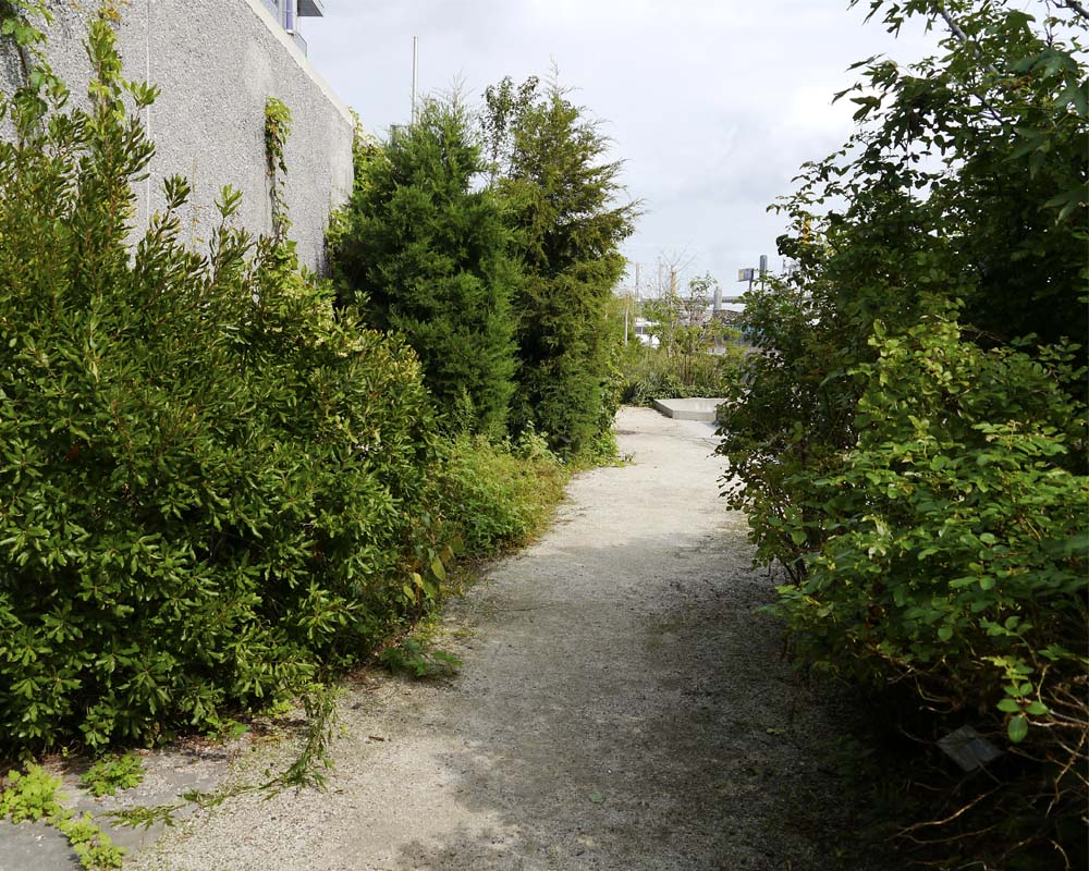
...planting creates tall green tunnels...

...and flowers and foliage appear more brilliant against the grey stone and concrete. 

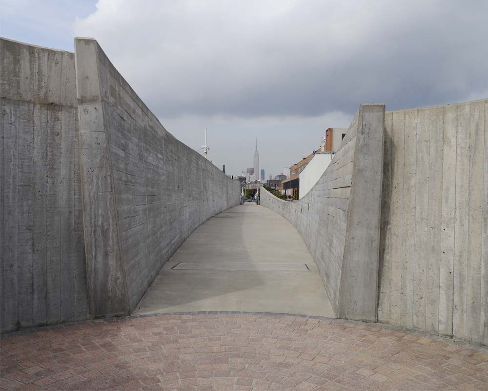
Retracing their path to the entry visitors pass through the swollen concrete walls of George Trakas’s 51 metre-long Vessel. Holes punched through the walls allow glimpses of the mechanical equipment and processes going on behind. The view straight down the centre of Vessel aligns with the Empire State Building, seemingly a world away from the unexpected tranquillity of this park-like space next to the sewage treatment plant. 

Now it’s over to you.

What do you think of the idea of public parkland in such an unusual location? Do you think the artistic overlay has resulted in a more engaging space? Leave a comment below letting me know.

If you know someone who’d enjoy reading this article be sure to share it, and check back soon for more from the wonderful world of parks, gardens and landscapes.

Details

This article is an edited extract from my book Future Park: imagining tomorrow’s urban parks, released this September by CSIRO Publishing.

The Newtown Creek Alliance is a "community-based organisation dedicated to restoring, revealing, and revitalising Newtown Creek".

The Visitor Centre at the  Newtown Creek Wastewater Treatment Plant is open by appointment.

The Treatment Plant was open as a part of Open House New York 2012.  Listings for OHNY 2013 will be released at the start of October.