Design Class: the deceptive simplicity of just one tree

Sometimes it’s easy to think of designers as a weird, black-clad species that flounces around shouting “Just make it pink! I vant everythink to be pink!” 

And admittedly, I’m sure there are some like that out there.

And…ahem…some of us do like black.

However for most designers, what they do is bloody hard work. Fun, and the only thing they could possibly imagine doing, but hard work nonetheless.

The sheer quantity and complexity of everything that must be considered can be enormous, even on the most seemingly simple of projects.

Today I’d like to share a landscape design exercise that I find very humbling. On the one hand, it lets complex tasks be broken down into smaller chunks. On the other, it reinforces the importance and impact of every decision we make when designing.

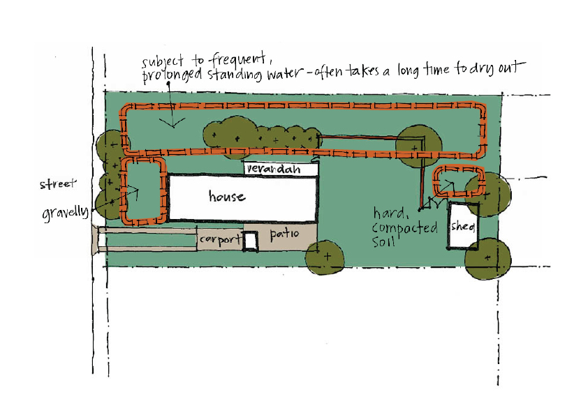
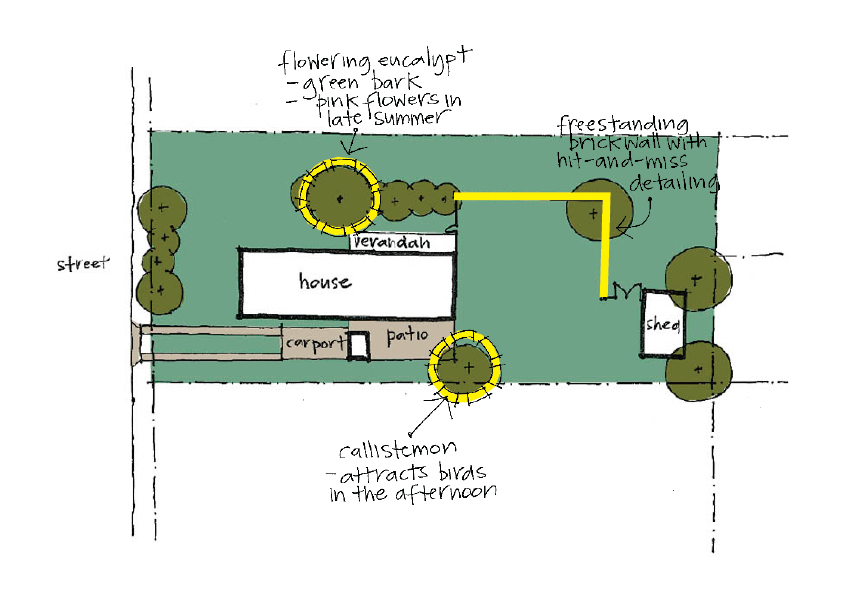
You start by imagining your favourite garden, park or street. I’m going to use the one we analysed recently.

That's the house in the middle. The shed is on the far right, and the street is to the left.

Now for the fun (and tricky) part.

You’re in charge, but you’re only allowed one tree. Just one tree. (You don’t need to consider what species at this point.)

Where are you going to plant it, and why?

For me, answering these seemingly simple questions requires me to think very strategically about how the different spaces in the garden already work, and how this new tree will alter things.

Here are a few of the options I considered:

Option 1

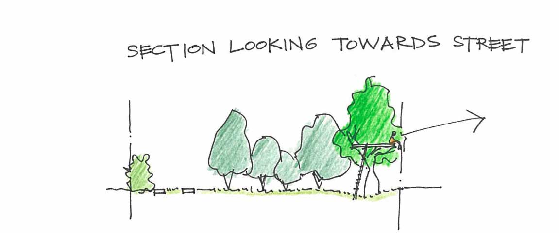
Placing the tree in the top left (north) corner. A tree here would provide additional privacy from the street.

Placing the tree in the top left (north) corner. A tree here would provide additional privacy from the street.

As the tree grows in this location I could build a platform in the branches and see across to the lake over the road.

As the tree grows in this location I could build a platform in the branches and see across to the lake over the road.

Option 2 

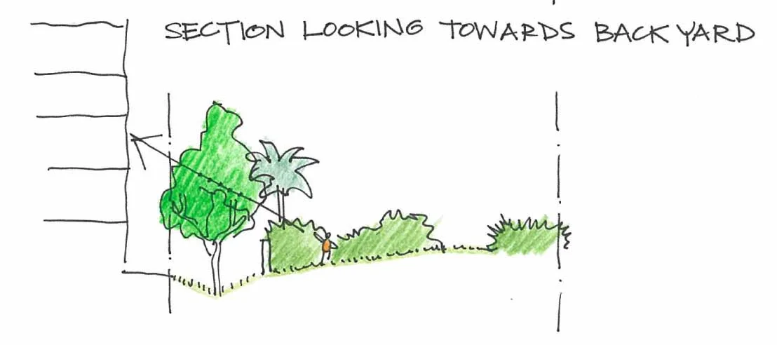
Placing the tree between the internal screen wall and the boundary.

Placing the tree between the internal screen wall and the boundary.

A tree here would help screen the back of the development proposed for next door, and would provide an element that’s closer in scale as the new multistory building.

A tree here would help screen the back of the development proposed for next door, and would provide an element that’s closer in scale as the new multistory building.

Option 3

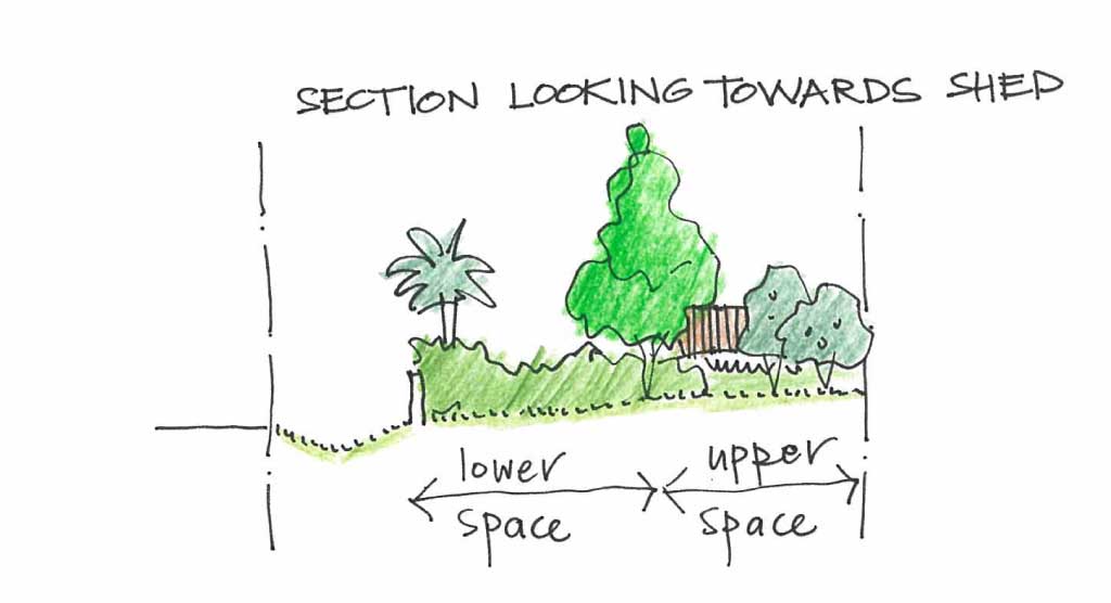
Placing the tree at the end of the existing planting, inside the screen wall. A tree here would shade the flat section of yard directly outside the house, enabling it to be used for more hours of the day.

Placing the tree at the end of the existing planting, inside the screen wall. A tree here would shade the flat section of yard directly outside the house, enabling it to be used for more hours of the day.

The tree would act as turning point or fulcrum between these two sections of the garden, allowing them to read as their own particular places. This tree would also start to screen the shed, so it would be less visible from inside the house.

The tree would act as turning point or fulcrum between these two sections of the garden, allowing them to read as their own particular places. This tree would also start to screen the shed, so it would be less visible from inside the house.

Each of these options creates different spaces and function in different ways. Which would you choose?

Where have you placed your tree? Why?

To really see the power of this exercise, ask someone else to imagine the same space you chose. Then, without giving away your answer, ask them where they would place just one tree, and why.

I love the one tree exercise because on the surface it seems so simple. But it’s valuable for three reasons.

Firstly, it shows that every complex design problem can be broken down into smaller parts.

Secondly, it shows that there are lots of possible solutions to even the simplest design challenge.

Following on, thirdly, it shows that every decision we make is a design decision, and the choices we make about all decisions have a direct impact on the spaces and functions of our landscapes. We do well to proceed thoughtfully.

So tell me…where did you plant your tree, and why?

ps: Let me know if you liked the coloured pencil versions of the sketches this week. (I do) Leave a comment below, or drop me a line. Thanks!

Design Class: 5 more site conditions to look for before designing

In our last Design Class we introduced  5 things to be on the lookout for in your garden or landscape: Orientation, Noise, Privacy, Drainage, and Access and Movement.  Observing how these things work gives a solid foundation to begin design work. This week we're going to add 5 additional things that are helpful to understand.

6.  Gradients and slopes

You’ll know if your block or your garden is sloping.  It’s also useful to know which direction it slopes, where the high points are, and if the slope is even or varied.  

7.  Existing vegetation

What is already there, where is it, and what condition is it in?  You can do this exercise for all vegetation, including trees, shrubs, groundcovers and climbers. Are there plants that change with the seasons, or have distinctive form, foliage, colour, scent, texture or flowers? 

8. Soil conditions

Even without carrying out a pH test you’ll have some idea about the condition of your site soil based on what’s growing successfully in your garden and nearby.  Similarly, looking at building sites or excavations in the area, and chatting to neighbours, is a good way of understanding the basic local geology before your engineer orders a geotechnical investigation. 

9. Services and utilities

Apart from overhead power lines, you mightn’t know exactly where service lines occur, but there are often tell-tale clues to their existence.  Manhole covers in the street or footpath outside your property are a clue to the presence of underground services.  Drains and pits often signify underground stormwater or sewer services.

10.  Special highlights

Are there any treasured parts of the garden that either work really well now, or have great personal value, such as a plant grown from one in your mother’s garden, a beautiful architectural element, or a favourite piece of sculpture?  

In future posts we will start looking at different ways you could respond to the findings of your site analysis. This is where it gets interesting, as two people might agree that a site has the same characteristics, but feel that different responses are required. That's where design comes in!

Now it’s over to you.

Has this exercise encouraged you to look at familiar scenes in a new way? It's only natural that if you find delight in chasing sunny spots in your garden, you may not have even noticed that some of the access points are a bit awkward, or that some garden areas don't drain very well.

Let me know in the comments section.

Of course, if you found this interesting and useful, why not double the fun and share it with a friend. 

Design Class: make analysis your friend

Have you ever had a designer ask if you’ve done any analysis?

Has it given you pause for concern, wondering if the headscarf and Jackie O sunnies you’ve been wearing to your therapy appointments are not proving such a great disguise after all? 

Fear not.

The type of analysis we’re talking about will leave your darkest thoughts blissfully unprodded, whilst helping you clearly and methodically understand what’s going on in your own back yard.

Site Analysis

A site analysis is best undertaken before starting any design work. Your designer should carry out her own analysis, based on research and observations on site.

You’re carrying out your own site analysis when you notice things that occur at different parts of the garden, at different times of day or year.  All of these observations can be compiled onto one or more site analysis diagrams.  We'll start with a simple plan that shows the location of your house on its site: 

Here are 5 things to consider when analysing your site: 

1.  Orientation

We’ve discussed Orientation in an earlier Design 101 post, so check in here to learn why it’s important to know where the sun rises and sets in relation to your place. 

2.  Noise

Whether it’s the teenage drum champion next door or the birdsong from the trees up the road, it’s useful to understand the source of both welcome and unwelcome sounds. 

3.  Views and Privacy

Who can see you, and who can you see from different parts of your property?  Where are there great views? 

4.  Drainage

What happened in the last big downpour? Where did the water go? Did it flow freely and soak away quickly, or did it pond in one place for ages? 

Landscapology_Analysis7.jpg

5.  Access and movement

Are there some parts of your garden you never use (or maintain) because it’s just too hard to get there? What about the connections between important destinations, like the house or street?  Where do different types of movement intersect: vehicles, pedestrians, bicycles? How about fencing: are there fences and gates, and who or what are they protecting - kids in? cars out? pets in?

In our next Design 101 we will complete our Top 10 things to analyse on your site before starting design. We will spend more time in future posts looking at different ways you could respond to your findings. Everyone’s response will be different, but the important thing is to start with a clear understanding of what physical conditions you have to work with on your particular site.

Now it’s over to you.

Look at your garden (or house, or room, or park) again with fresh eyes, and quickly run through these first 5 points of analysis.  How many of these items are things you’ve always been aware of, without describing what you were doing as a site analysis?  How many other things have you just noticed, even though they were there all along.

Let me know in the comments section.

Of course, if you found this interesting and useful, why not double the fun and share it with a friend. 

Design Class: elephants never forget...and they can teach you how to read drawings

Have you ever had a designer invite you to go through some drawings? Has this given you pause for concern, worried that you’ll be confronted with a pile of papers full of squiggles and lines that make no sense whatsoever? 

Fear not.

This is actually a really common concern.  For some it can be worrying enough that they actually delay a much dreamed-about project.  Of course, your designer should be doing everything possible to guide you through, but it’s still important that you can read drawings with confidence.

Why?

You can make sure that everything you’ve discussed and agreed with your designer is incorporated.

You have a clearer idea of what the finished product will look like and how it will function.

You will feel more empowered and able to participate fully in the design process – after all, having your new house, garden or renovation designed should be an exciting and rewarding experience!

Today we’ll start right at the beginning, and look at the basic principles of reading drawings. And as this fear is often the elephant in the room at design meetings, we’ll use one of those lovely creatures as our life model for this session. 

Most projects will start with planning. Plans are the way designers make sure everything is in the right location and that everything will function properly.

Plans

Plans show what your project looks like from above.  A ground floor plan shows the building level closest to the ground, and it usually shows what’s happening about a metre above the actual ground level.  Our elephant pal Trunky’s ground floor plan would look something like this:

Buildings usually have a roof plan too. Imagine you were in a plane flying overhead. If you looked down, what would you see?  For our obliging friend it would be something like this:

Elevations

What about how the outside looks?  To describe that we use Elevations. Each elevation shows what the project looks like from a different side.  To describe Trunky we would use a front elevation,

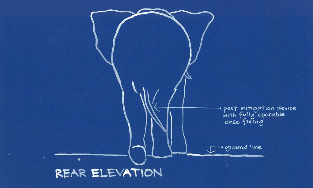
a rear elevation,

and a side elevation:

Sections

The next thing to describe is how things are made, and how the different spaces work in three dimensions. To do this we use Sections. A section is like a slice through the building or garden.  Sections show things such as how the ground floor and upper floor work together; how stairs work; or how a swimming pool sits in the ground next to a terrace.

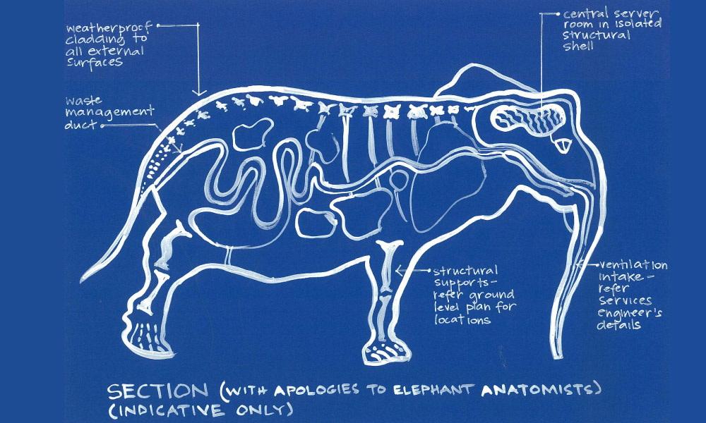
Let’s see what’s going on inside Trunky. If you imagined him sliced in half through from trunk to tail, and looked at the cut surface, you’d get a section something like this:

So there you have it.  You can apply this technique to reading any drawings, and it’s easy if you stop and remember that:

Plans show something from above;

Elevations show the surfaces of something from outside;

And Sections are slices through something to see how they fit together on the inside.

Of course, things can get more detailed (and potentially more confusing!) than this, and there are different types of drawings for different stages of a project, but these basic principles remain the same.

Now it’s over to you.  Have you ever been surprised with the way something has turned out on a project, because you weren’t 100% certain from the drawings how it was going to work?  What else would you like to know that would help you read drawings more confidently?

Let me know in the comments section.

Design Class: but how does it make you feel?

Have you ever heard designers speak about the way something feels?

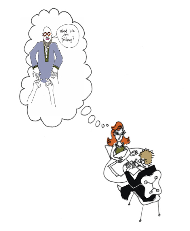
Has it given you pause for concern, worried that any moment now someone's going to grab your hands, look deep into your eyes and ask you to share your feelings? 

Fear not.

What we're talking about here are the qualities that affect how you feel when you’re in a particular room, garden, house, building, park, or city - any place really. 

How does this place make you feel?

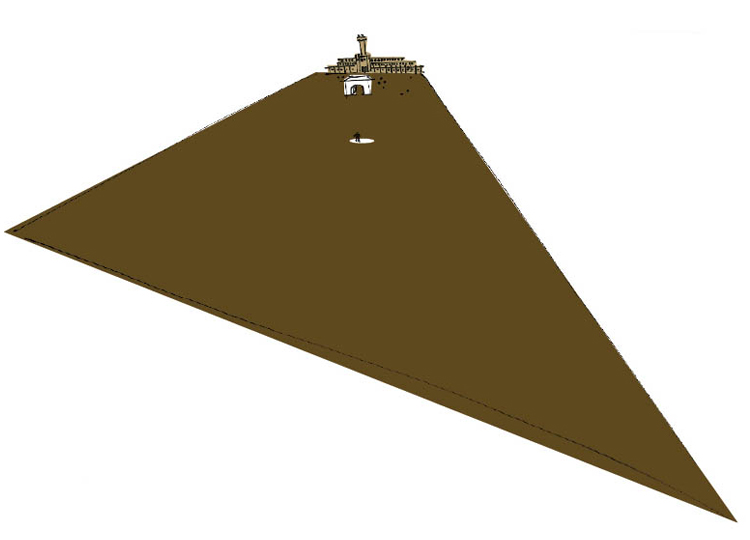
A bit freaked out, maybe? Is it overwhelming?  The edges are a long way away if you're standing there in the middle. There’s nowhere to find shelter or privacy.  Everything you did would be on full display.  Unless you're a despotic dictator with need to frequently remind your peoples of your terrific might and power, you'd be unlikely to feel especially relaxed in such a place.

How about this place?

It’s different, isn’t it? It’s a lot more enclosing and protective for one.  Perhaps you find it more welcoming.

This one?

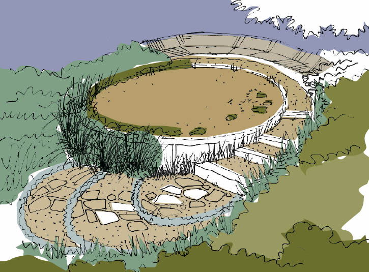
Some people might find this place private, secure and serene. Others might find it a bit isolating.

Why is this important?

If you start to notice and understand how different places make you feel, it’s much easier to describe how you want places in your home or garden to feel. And once you know, it’s much, much easier to work towards achieving that feeling, or quality.

There’s lots of ways to achieve the quality you’re after, and we’ll talk about some of them in future Design 101 topics.

Now it’s over to you.

Think about your favourite place, either at home or somewhere you’ve visited.  Now tell me what qualities it has – how does it make you feel when you’re there?

Let me know in the comments section.

If you found this useful and interesting, consider sharing it with a friend, and I’ll see you soon for more Design 101.

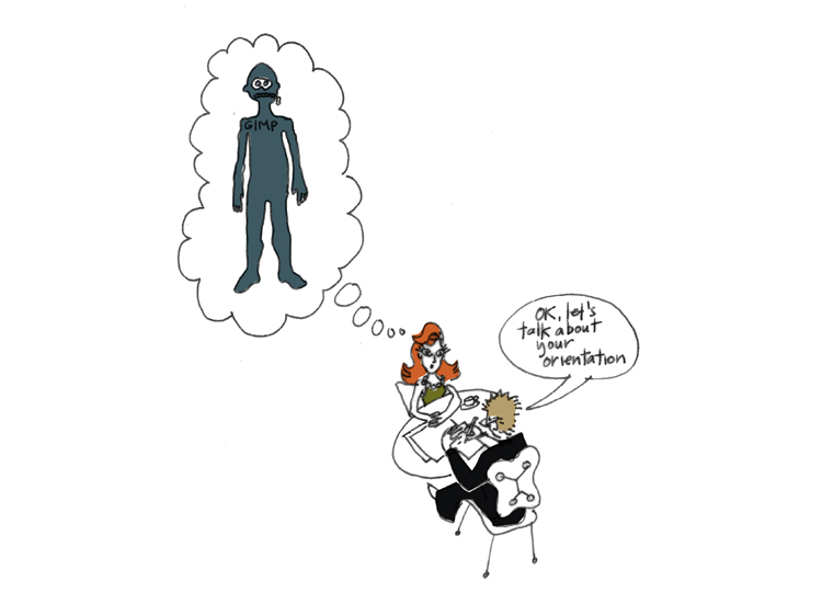
Design Class: learning to love your orientation

Have you ever heard designers speak about orientation? Has it given you pause for concern, worried that your penchant for wearing latex and scuba suits in manners for which they were not originally intended is about to be revealed? 

Fear not.

The orientation we’re discussing here, if properly understood, will actually make it easier and more comfortable to enjoy the things you want to do in the privacy of your own home and garden.

So what is orientation?

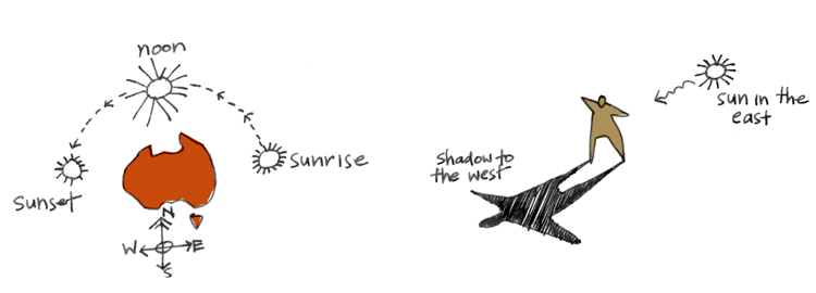
Orientation simply means the location of your garden and home in relation to the sun.

In Australia the sun rises in the east, travels through the sky to reach the north at noon, before descending again to a western sunset. In summer the sun is high, and in winter it is lower. 

Why is this important?

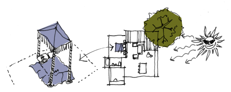
If you live in northern Queensland and you want to have Christmas lunch outside on your new deck, then you don't need me to tell you that you need to understand where the sun’s going to be at come midday. Once you know, you can make sure the deck is placed where it can be shaded by trees, roofing or a combo of the two.

On the other hand, if you live in high country Tasmania, you'll probably want to plan your deck and garden so you’ll be warm and sheltered. Seems pretty obvious when you think about it, but you'd be surprised how many houses have been built that don't take account of this simple, yet significant factor.

This approach translates through every aspect and detail of designing your home, garden and landscape.

Do you have bizarre night time rituals that require long, uninterrupted sleep-ins? Maybe don’t put your bedroom on the east side of the house. 

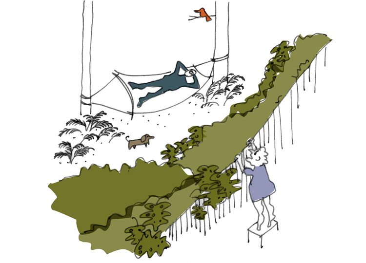
Like to swim in a cool oasis, out of the sun? Maybe put your pool to the south, or make sure there’s space for a dense surrounding garden with shade trees. 

Want to grow a kitchen garden? Make sure adjacent buildings or trees aren’t over-shadowing the space. 

And finally, if you do wish to loll on the lawn in your scuba suit, then maybe some strategically placed sun shading will protect your privates from poaching, and your neighbours from nosying. 

Now it’s over to you. How did you enjoy the first lesson in Design 101? What would you like to learn about next? Let me know what weird words you've heard designers use that you'd like clarified. And finally, let me know how understanding your orientation is going to free you up to think more creatively about how you plan things in your home and garden, scuba suit or not.