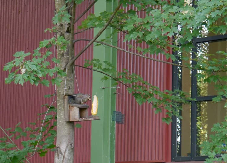
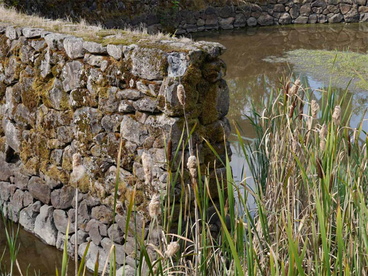
The Alfred Caldwell Lily Pool.
Read moreParque del Agua: the gift of water
What could be more welcome on a hot, sticky day than a cool, shady park?
Not much, I reckon, unless it’s a cool, shady park that sells ice cream.
With that in mind, welcome to Parque del Agua – ‘Water Park’ – in Bucaramanga, Colombia.
Visiting Bucaramanga involves landing at Palonegra airport. And landing at Palonegra airport involves descending at rapid speed towards a runway that seems to be perched on top of the steepest mountain in South America. Until the moment you actually hit the tarmac, all that is visible out the airplane windows are similarly towering mountains all around, and the sheer drop below.
It’s worth it though, because this is a ripper of a park.
It sits on a corner site, roughly D-shaped, and the ground rises steeply up 20 metres from the bounding streets.
Glimpsed views of the surrounding streets.
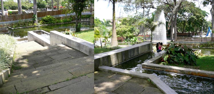
Stone steps and ramping pathways negotiate the sloping terrain.
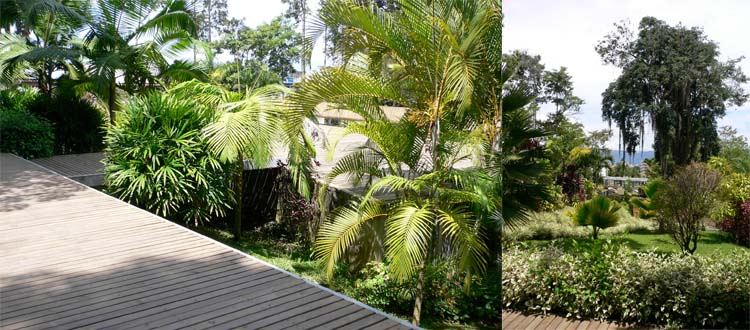
Inside, angled stone paths wrap around the curving part of the ‘D’, and are joined at the top of the hill by a long timber deck.
The planting is lush and luxuriant, with foliage plants, climbers, and flowering tropical species.
Existing mature trees on the site were incorporated into the planting design.
A towering bamboo canopy arches over the timber deck, shading an equally long bench seat, and directing attention to a series of stone pillars standing between steep cascades.
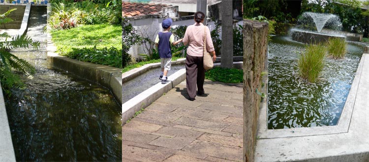
Water is the real star here. From the top of the hill it splashes, pulses, sprays and rushes to the bottom, stopping only to fan out in wide, flat pools. The sound of water is everywhere too, quieting the outside traffic and allowing groups to converse without being overheard.
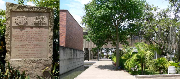
Water is also the surprise at Parque del Agua. Why? Because this is a park owned and operated by the local water treatment authority. The Acueducto Metropolitano de Bucaramanga (AMB), is also headquartered here.
The AMB headquarters buildings also step down the sloping site, joined by aerial walkways that shade the paths below.
At its establishment in 1916 the AMB was charged with supplying water to Bucaramanga and two other nearby towns. As demand grew so did the need for additional facilities, which the AMB developed and operated until 1975, when it was bought by the local council.
From its early days the primary water treatment plant was located here at Morrorico, on the eastern fringe of the city. The actual treatment facility occupied only a small portion of the large land-holding, and local residents became used to enjoying the spontaneous tropical landscape and lawns of the park-like grounds.
Expansion of the plant reduced the amount of land available, and after the council buy-out a shared company took responsibility for water treatment and supply. Public use of the land dwindled and the once vibrant community gathering place became neglected.
Fast-forward to 2001, when AMB Manager Victor Azuero Diaz proposed moving the company’s administrative functions back to Morrorico. With the support of the Mayor a park was proposed for the site, in homage to the former public appropriation of the land for recreation.
When you understand this, the water really makes sense. The two ways water is used in the park (fast-flowing and still pools) reflects the way it is used in water treatment engineering.
The brightly coloured animal artworks on the wall (left) are illuminated at night, and supplemented at Christmas by other installations throughout the park, drawing big crowds. The Planning Department (right) enjoys prime position in the centre of the park.
Although the administration of the system is the main activity, functional run-off tanks still operate on the site. Where the park could undoubtedly go further is in pushing its abundant planting and water to be more than just ornamental. As well as creating a welcoming cool environment for visitors, how marvellous would it be if they actively showed how rainwater could be detained and slowly released to reduce local flooding, or how biological treatment could help cleanse of water prior to its release back into the catchment, both worthwhile exercises in a tropical environment.
Although in Brisbane we would probably call these missed opportunities, we should not underestimate the success of Parque del Agua. It is well constructed, with inventive use of just a few materials: stone, gravel, concrete and timber.
It’s a well-loved, well-patronised local landmark, with a lot to teach us about the ways land associated with a municipal utility authority can be effectively made available for public use and enjoyment. And on a hot, sticky day, it sells ice cream!
Now it’s over to you.
What did you think of Parque del Agua? Do you think more of our public utilities and authorities should be trying to ‘give back’ to their customers and communities in such a way? Let me know in the comments below.
And don’t forget, sharing is caring, so if you know someone else who might find this interesting, why not share it.
See you soon for more garden, landscape and design stories.
Note: Parque del Agua was designed by Lorenzo Castro, Michelle Cescas, Alfonso Leyva and Geman Samper. It is located at the corner of Carrera 34 and Calle 20, Bucaramanga, Santander, Colombia. Find out more about the history and opening hours at the AMB website (in Spanish).
This project is included in the chapter on Co-location Parks in Future Park.
Jamison Square Fountain
A cascade, a pool, and so much more...
Water is one trick designers always have up their sleeve if they want to attract a crowd.
A true honeypot of public space design, thoughtful ponds, cascades, rills, reflecting pools, pop jets, bubblers and other watery wonders will draw people in every time.
They can be big, small, solemn or silly, and some of them manage to appeal to people of all ages. A rare few even look good without any water.
One such marvel is the Jamison Square Fountain in Portland.
The Fountain was built in the mid-2000s and is a well-publicised urban water feature, but it’s worth revisiting to remember just why it’s been so successful.
1. A catalyst for change
Jamison Square was a catalyst project for the redevelopment of the Pearl District, to the north of downtown Portland. Once home to railway yards and light industry, The Pearl is now a textbook urban renewal neighbourhood of mid-height buildings, thousands of new residents, ground floor shops, generous, walkable footpaths, convenient public transport and a variety of parks and public places.
2. Simple concept
The design concept is incredibly simple. There are only three elements to Jamison Square: a timber ‘boardwalk’ – a timber footpath effectively, that runs along each block of The Pearl towards the river, and recalls the former riverfront walkways; a gallery – a number of large-scale public artworks are installed; and the fountain itself.
Looking into the Square from above. The boardwalk is in the foreground. Look for the row of stone blocks snaking through the middle of the park.
Image: Flickr User pondskipper via Wikimedia Commons.
The contemporary totem is one of four artworks marking the entries to Jamison Square.
3. An engaging experience
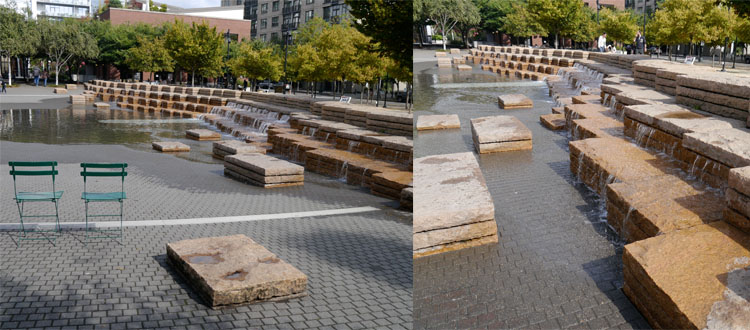
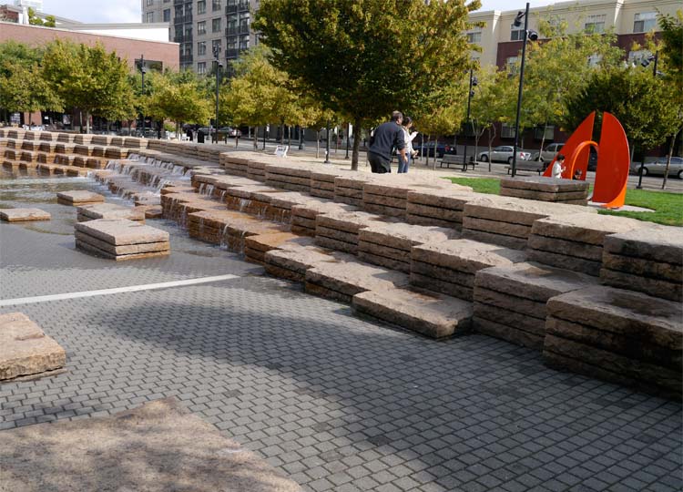
The backbone of the Fountain is a long wall, slightly curved in the middle. It is made of chunky, stacked stone blocks, perfectly arranged for little kids to negotiate the top with someone holding their hand, or for big kids to dash along.
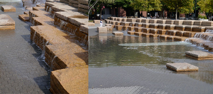
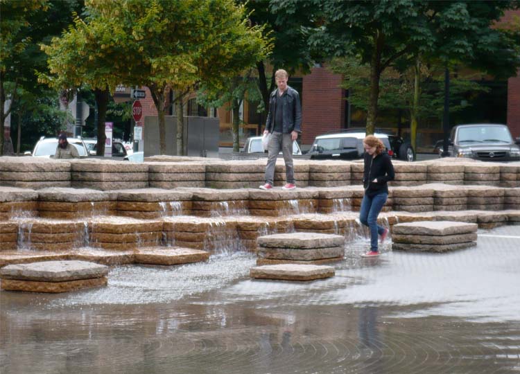
Beyond the wall the stone stacks decrease in height and vary in spacing. In some places it’s still possible to make the entire journey on the stone steppers. Elsewhere it becomes trickier once you add in…the water.
On regular intervals water starts to spill out of cracks and crevices in the rock. It starts in the middle with a tiny trickle, then moves on the rock stack next door, then the next one, then the one in front, and so on until it some places the water is 300mm deep.
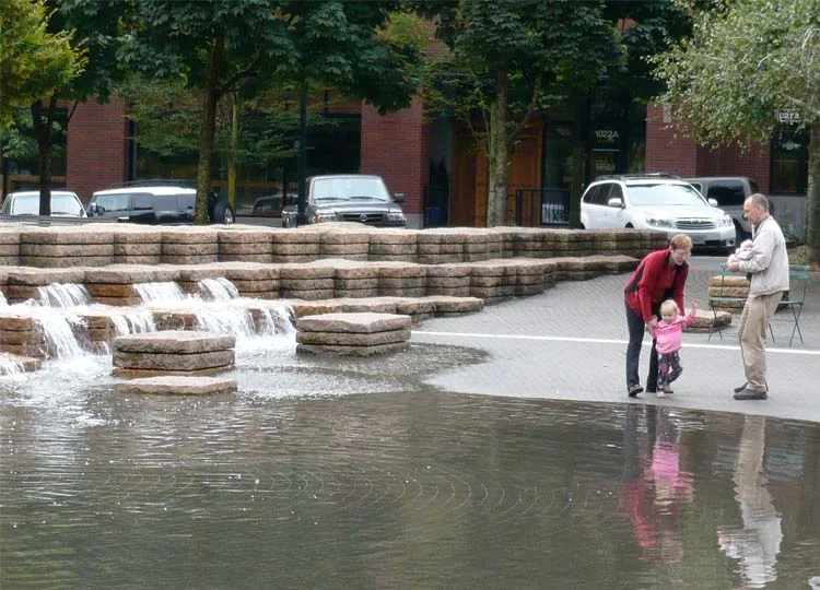
The pavement in front of the wall slopes gently down, creating different water depths, and allowing kids of all ages to enjoy the experience.
Once the basin is full the water slowly drains away, till only the stones remain and the whole process starts again.
4. A versatile space.
The Fountain has been designed to be experienced both with and without water.
The water can be drained and the Fountain used as amphitheatre seating for events in the Square.
5. A user-friendly space.
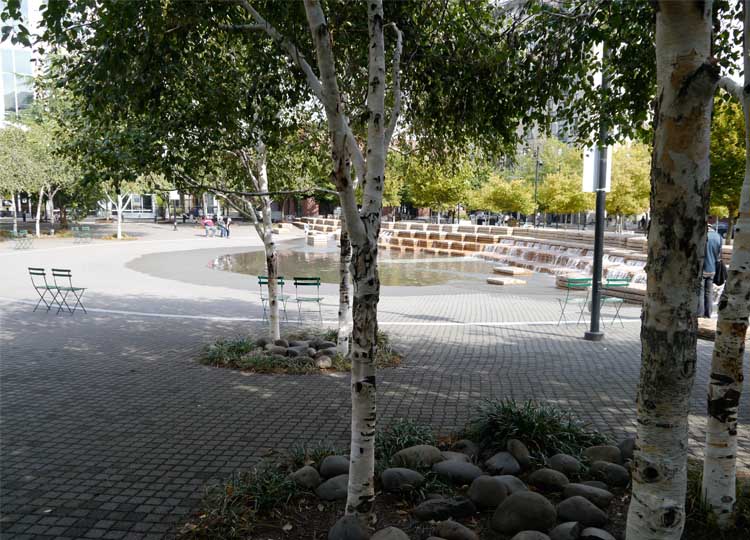
Movable folding chairs are scattered around the Square, easily repositioned according to your preference for sun, shade, distance from or closeness to the Fountain. The street blocks are small and the footpaths generous, so it’s easy to get to the Square, in fact it’s almost impossible to avoid it as you’re walking through the district. The quality of construction is excellent and maintenance is obviously a priority, all contributing to the sense that this is a well-loved and highly valued piece of the city.
Now it’s over to you.
What do you think about Jamison Square Fountain? Let me know one thing that appealed to you the most. Of course, if you’ve visited Jamison Square, I’d love you to share your thoughts on the experience.
If you know someone else who might find this interesting, why not share it, and if you liked it ‘heart’ us below. Go on...give it a shot.
Thanks for reading, and see you soon for more garden, landscape and design stories.
Note: Jamison Square Fountain was designed by PWP Landscape Architecture. It is located at 810 NW 11th Avenue, Portland. It Find out more about the history and opening hours at the City of Portland website.
Although we visited on a rather bleak day, lot's of people were still engaging with Jamison Square Fountain. This image gives a glimpse of what it's like on a summer's day - pandemonium! If you're in Portland in summertime, go check it out.
Image: Gary Halvorson, Oregon State Archives.
A Story of Sexy Swales, Swirls and Stormwater
You and I are over 50% water, and water covers around 70% of our home planet.
Water is as fundamental to our survival as oxygen, yet we often take it for granted.
Next week I have the honour of giving a presentation to a wonderful group of people who make it their business to think about water.
My audience at the 8th International Water Sensitive Urban Design (WSUD) Conference will include the engineers, designers, scientists and policy makers who are at the cutting edge of thinking about water in our cities: how we get water when it’s dry; protect ourselves from it when it floods; treat and clean it; and how we manage the rivers, lakes and water bodies in our cities.
I’ll be talking about parks as a way of bringing people and water infrastructure together.
I’ve written about parks such as the Newtown Creeek Nature Walk before. The Nature Walk brings visitors bang up against New York’s biggest sewage treatment plant, and one of its most polluted waterways, yet still manages to provide a calm and artful oasis full of inviting moments.
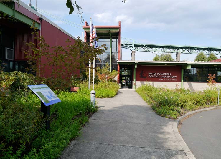
Today we’re heading to the opposite side of the US, to visit Portland’s Water Pollution Control Laboratory.
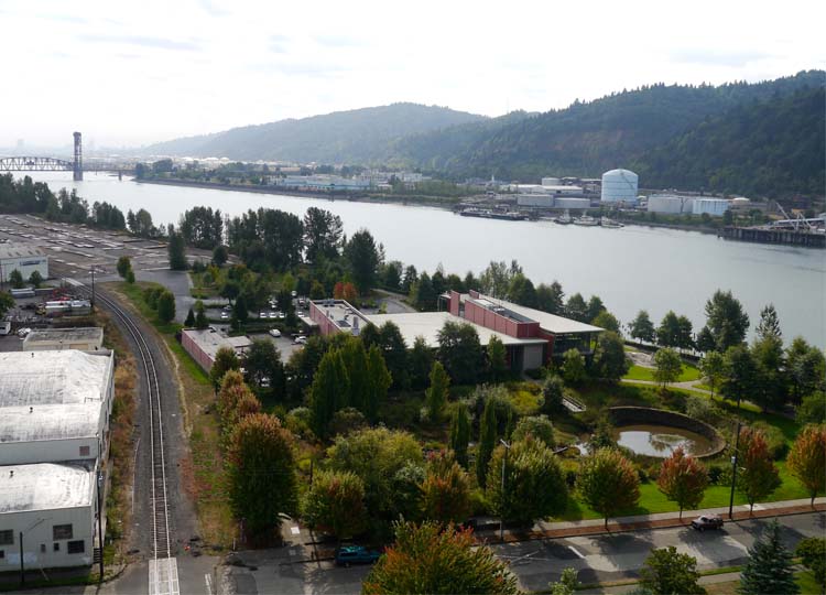
The Water Pollution Control Laboratory is the red building in the centre of this image, surrounded by extensive gardens. Downtown Portland is on the opposite riverbank in the distance.
Whilst WSUD is still a new concept to many people, this building, and its surrounding water sensitive landscape was established in 1997.
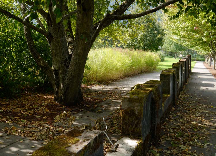
Approaching the Centre, remnants of former structures remain visible.
The building is home to the Portland Bureau of Environmental Services Pollution Prevention Services, which monitors water quality in the surrounding area. Six labs totaling 1,400 m2 provide start-of-the-art facilities for testing and identifying environmental pollutants.
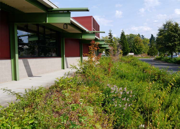
The building itself features many cost-effective, energy efficient elements, including the large roof overhangs...
windows that can be opened
and generous spitters that direct rainwater into the gardens below.
Rocks directly below the spitters absorb the impact of the falling water, which then spreads into the garden beds, irrigating the plants and allowing the removal of waterborne pollutants.
The garden beds form part of a landscape that educates visitors on alternative ways of managing pollutant-laden stormwater runoff. It treats the runoff from 20 hectares of surrounding streets, paths and neighbourhoods, as well as the lab’s carpark.
The 60-car parking area is also water friendly, with runoff being directed towards lushly planted swales. The planting really breaks down the expanse of asphalt – in some areas the cars are all but hidden – and provides space for shade trees.
Adjacent to the carpark are test plots, where different plant species are trialled for use.
The centrepoint of the landscape though, is the 6,000 m2 water garden.
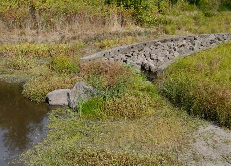
Water runoff enters via a rock lined channel, or flume, which slows it down. When it’s not raining this forms a sculptural element in the landscape. (Flume - what a great word! Flume. Flume Flume. I love it! Ahem...)
The water is then held in a pond, where it can be treated and either held on site, or released along a curving overflow into the river.
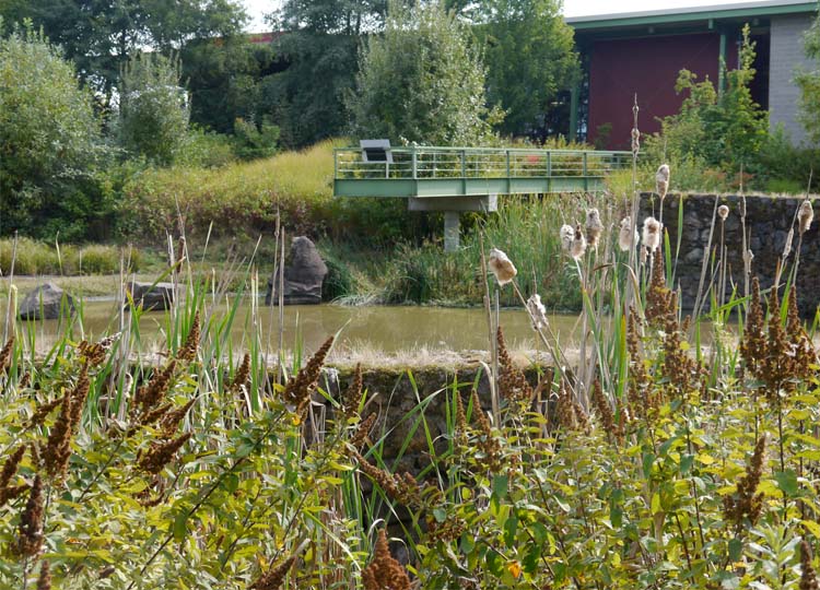
Lush aquatic and emergent planting surrounds the pond, and a lookout platform allows you to get right out over the water.
The lookout viewed across the pond...
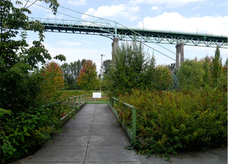
...and on approach.
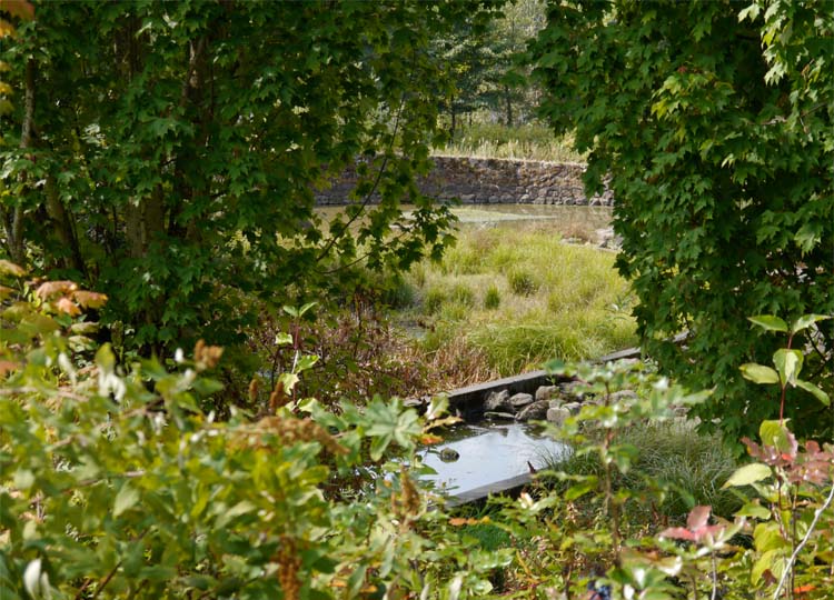
From there you’re taken on a journey around the pond, through well established planting that at times screens out views of the pond, the building, and even the St Johns Bridge.
It’s a delightful place to visit, and I imagine a great place to work or to take your afternoon cycle (this is Portland after all!).
The water garden was apparently a controversial element in early days. Even though the site had previously been used for industry, many local residents were concerned they would be getting another problem in their backyard, rather than an asset.
Effective monitoring and adaptation over time has ensured that the water garden functions well. And the initial decision to create a sculptural landscape, that integrated with the building and connected to its riverfront setting, has seen the Water Pollution Control Laboratory and gardens become a well-used, and much-loved landmark in the St Johns neighbourhood.
Now it’s over to you.
What do you think of the Water Pollution Control Laboratory? What element most resonated with you? Was it the simple building details that make it a more comfortable place to work, like opening windows? How about the carpark, full of planting that cools the temperature and, let’s be honest, makes it a helluva lot more attractive that just a baking sea of asphalt? And what about the water garden, with its gorgeous stone walls combining with a serious purpose and function?
I’d love to know – please consider emailing or dropping me a line in the comments below.
Of course if you know anyone who’d enjoy this article, please feel free to share. There will be more from the wonderful world of landscape, architecture and design next week.
The multi-award winning building was designed by Miller Hull.
The landscape, also multi-award winning, was designed by Murase Associates.
The sculpture 'Raindrop', is by artist Don Merkt.
All images © Amalie Wright and Richard Buchanan.
Read more about this and other co-location parks in Future Park: imagining tomorrow's urban parks.
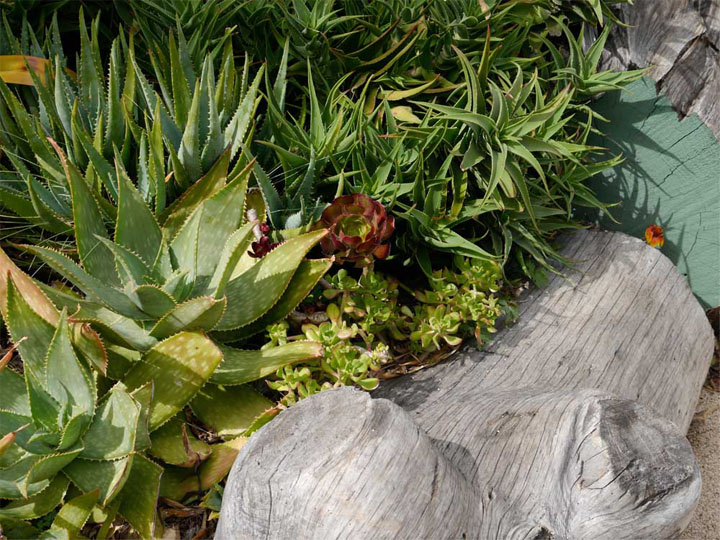
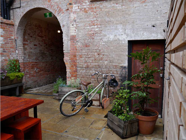
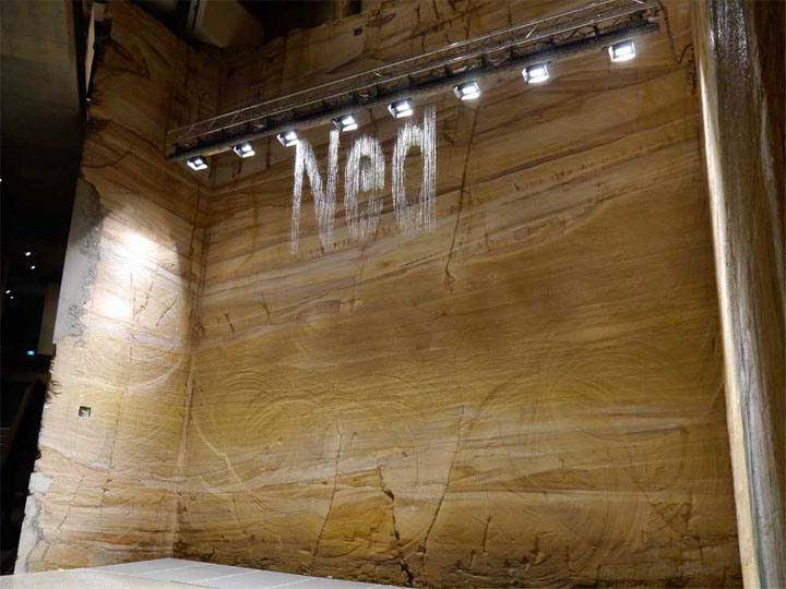
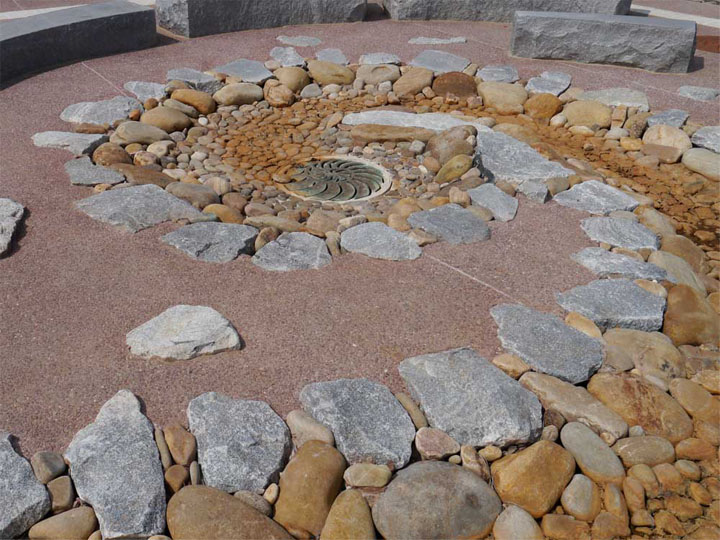
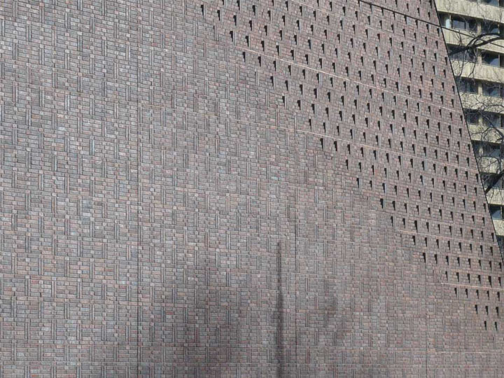
A Celebration of Texture: Sometimes the Bumpy Bits are the Most Interesting
Have you ever noticed the way reviewers will sometimes describe a book, or a film, or a character's life as being "richly textured".
This often seems to be shorthand for "they're up their ears in so much half-baked, chicken-with-its-head-cut-off, crazy-ass craziness, they don't know if they're coming or going".
As someone who has known a moment or two of richly textured life in my time, I thought it high time we trained our laser-like focus on the beauty and delight of the textures that surround us.
When so much of our lives is about streamlining and smoothing out the bumps, it's good to remember that the bumpy bits are often the most interesting.
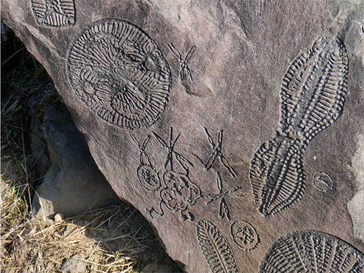
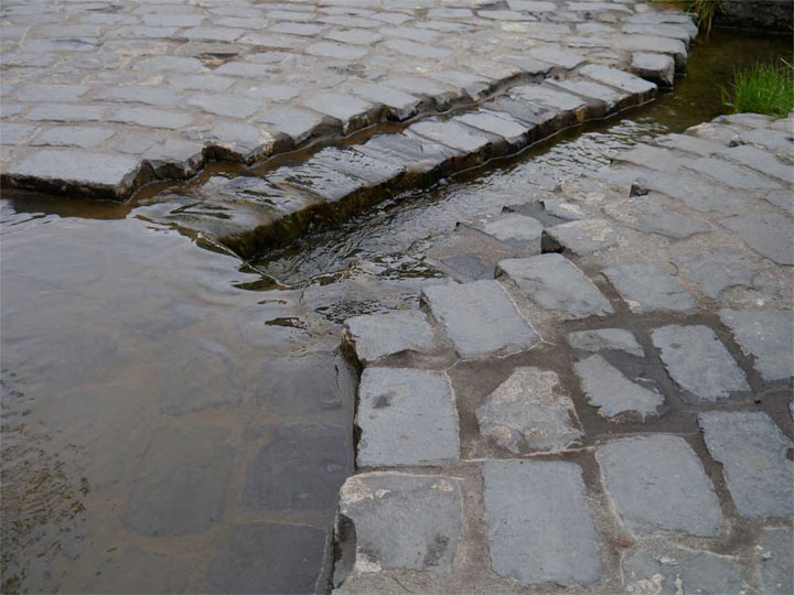
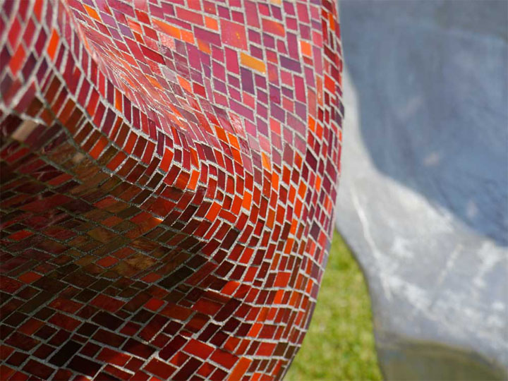
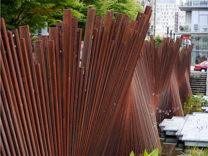
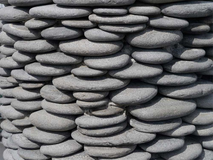
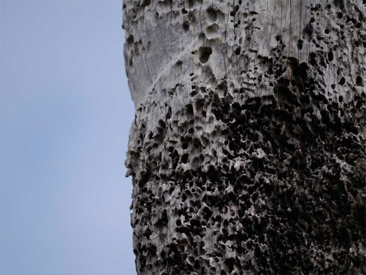
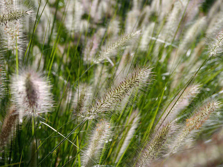
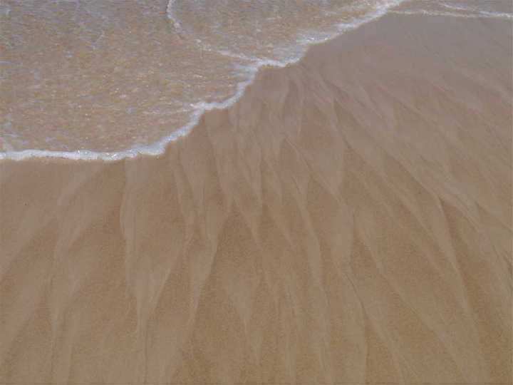
The texture of things catches the light and the rain. Textures can invite or repel. Textures can be experienced with our eyes, our hands, our feet...and whatever else you're up for. The texture of things is critical to how we experience the spaces around us.
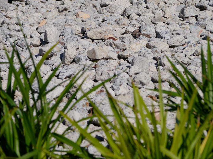
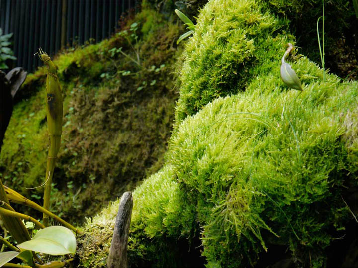
So that's it. Please enjoy this small collection of wonderfully textured paths, pavements, walls, artworks and plants.
What did you think? Any favourites? Maybe there was a texture you hadn't considered before. I'd love to hear, so please let me know in the comments below.
And of course if you know someone else who'd enjoy this little dose of inspiration, feel free to share it.
Thanks for reading, and come back soon for more from the wonderful world of inspirational landscapes.


