Highlights from buildings and gardens on show.
Read moreStudio 217: a ‘cabinet of curiosities’ for designing and dreaming
Studio 217 is located in the partly subterranean basement of heritage-listed Craigston, and is a tiny space – barely 32m2 – tucked off the main carpark.
The studio reconfigured an existing internal space that has undergone change over time, being used first as part of the general carpark, then as enclosed storeroom, caretaker’s accommodation and finally a solicitor’s office, before its present use.
Looking in the same direction as the first image, this shows the space as it was at the very start of the project.
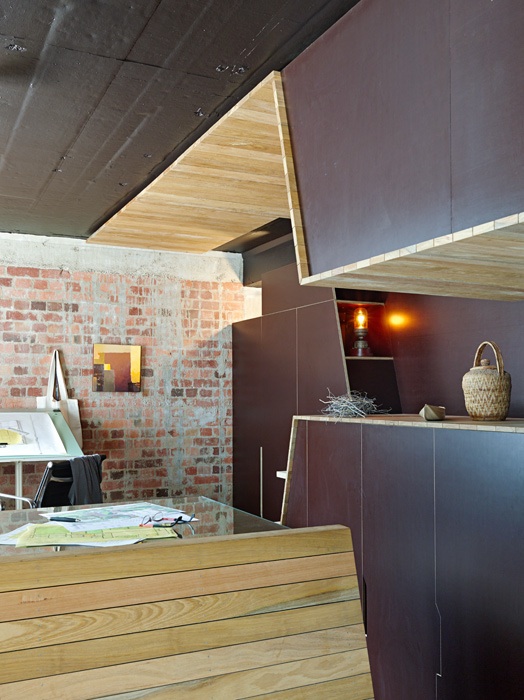
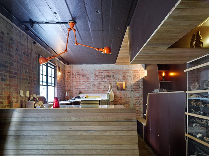
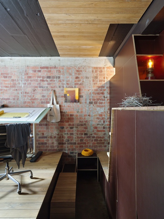
Dark, cave-like materials and finishes reinforce the basement location. There are eight storeys of building above, and a partly lowered ceiling creates a sense of compression.
Just inside the entry, with the compressed ceiling above.
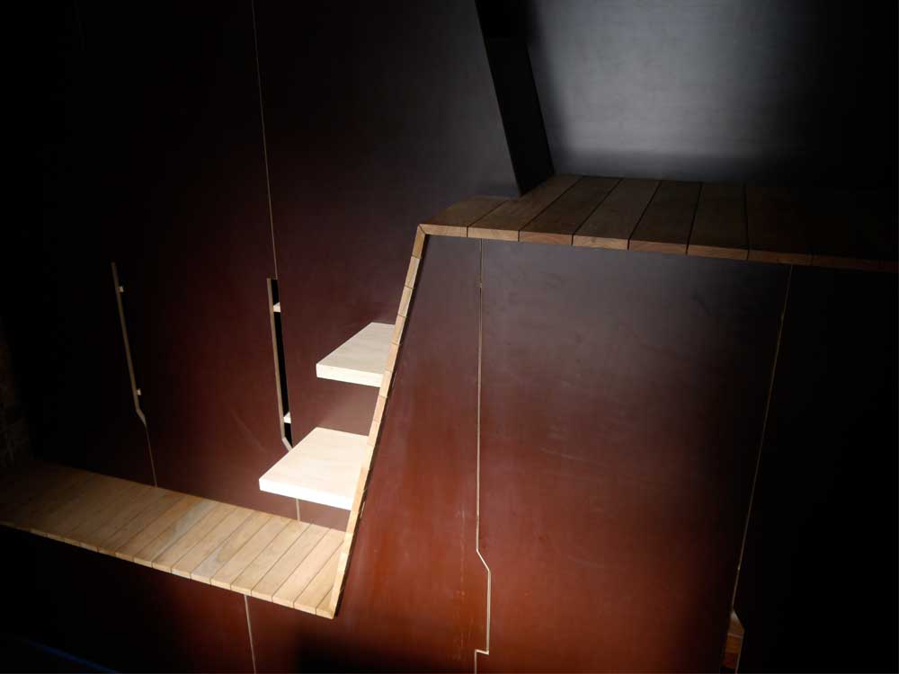
The underlying geology of Spring Hill, in particular the layered, tilted rock strata, is expressed using strong horizontal lines interrupted by sloping planes.
To minimise the impact of potential water ingress formply was used extensively, the dark colour enhancing the cave-like atmosphere.
Research through the Queensland Herbarium uncovered a list of tree species endemic to Spring Hill pre-European settlement. White Mahogany was on the list, and recycled timber boards of this species appear on the surfaces where people sit or lean, and on the underside of the low ceiling band.
The project stripped plasterboard wall linings, removed floor tiles and a suspended ceiling to reveal the concrete slabs, columns and brick walls. These are part of Craigston’s pioneering construction: built in 1927 it was Brisbane’s first ‘high-rise’, and reportedly one of the first uses of reinforced concrete.
The timber studwork supporting the old plasterboard was donated to a friend, who used it on his own construction project. MDF, two-pack and volatile finishes were deliberately avoided. Brick walls were cleaned by soda blasting, which is less aggressive than sand blasting.
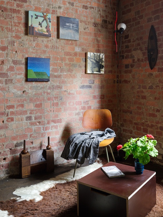
The warmth and texture of the existing brickwork was revealed after soda blasting. Concrete 'drips' running down the face of the brick shows the original method of constructing the concrete framed building.
Low-VOC paint was applied to the ceiling, and the exposed concrete floor finished with tinted penetrating oil. Plywood shelves and recycled timber boards have been left unfinished.
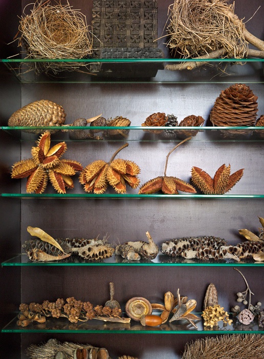
Numerous functional requirements were accommodated, including overnight guest accommodation, a piano, extensive library, a collection of seed pods, lino-printing facilities, and drawing board and design studio for two.
The Landscapology collections have a new home.
Drawing board and desks occupy the raised platform.
A raised platform enabled a desk at window sill height, taking advantage of morning light for detailed work. The space below houses a slide-out bench seat and bed.
The studio conceals its surprises...
...and then slides to reveal the concealed seat, bed, piano and more.
Enclosing the piano within the joinery enabled a perched seating platform, and sliding cabinets contain collections and conceal artworks and the building structure behind.
Apart from task lighting at the desks, lighting levels are deliberately low. Lamps are concealed, with light ‘leaking’ into the space through cracks and crevices.
Previous occupants enlarged an original window to create a new doorway, and within this the new sliding door is the main evidence of new occupation visible from outside.
The external courtyard provides the sole access to the studio, as well as pedestrian access to the carpark level of the building for residents. It was previously paved flush with the internal studio floor, and inadequate drainage resulted in frequent inundation.
New infrastructure was installed, and the external level lowered. The pavers were reused to construct new steps, and sandstone steppers reclaimed from previous Craigston use were added. Broken bricks salvaged from an internal renovation in the building were smashed with a sledgehammer over several weekends, and used to create a permeable mulch layer.
Undoubtedly the most important people involved in making Studio 217 a reality were our builders, Rob and Chris Hogerheyde, from RAM Constructions. From start to finish they were extraordinary, achieving their customary craftsmanship and attention to detail in very cramped quarters. They even made an art installation to welcome us home after an extended holiday!
Q: How many lattes does it take to build a studio? A: A lot. Many more than this...
It goes without saying that without them, our studio wouldn’t be half the place it is today. Thanks, guys.
Studio 217 was a design collaboration by Amalie Wright and Richard Buchanan. It was recently awarded a Small Project Architecture Regional Commendation at the Brisbane Regional Architecture Awards.
Except for 'before' and 'during' construction shots, all photography by Christopher Frederick Jones.
Starry, starry night: the Garland Garden ceiling
“I want to use the area under the deck for sitting and entertaining, but I don’t want to look at the underside of the deck.”
Such was the challenge laid down by our client at the initial briefing for what would become the Garland Garden.
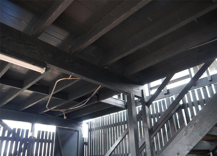
The deck had been added before our client bought the house, and it hadn’t been constructed with a great deal of care. Whilst recent architectural renovations had better integrated the deck with the house, underneath was a different story.
As well as providing a more visually interesting experience, we also had to consider options for nighttime lighting, and a solution that would survive hosing down the deck above. It also had to work with our scheme for the rest of the garden, which was going to be better integrated with this part of the house.
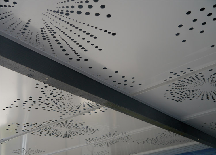
After exploring a few options our client quickly selected a proposal for a series of panels perforated in a decorative pattern, all to be backlit by lights fixed under the deck.
We hunted for inspiration for the pattern: needing something that related to both the circular forms in the garden, and the orthogonal geometry of the house and deck. Arriving early for a meeting one day I noticed a pane of stunning old glass at the front of the house, and we had our inspiration.
Over several months we refined the design.
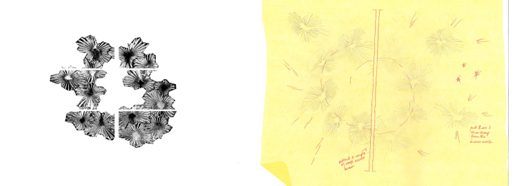
We started with the glass pattern and edited it into a garland form.
We then had to find a way to turn the ‘starburst’ pattern of the glass into lines on the pages.
We decided to create each line out of many smaller circles, increasing in size and spacing as they moved away from the centre.
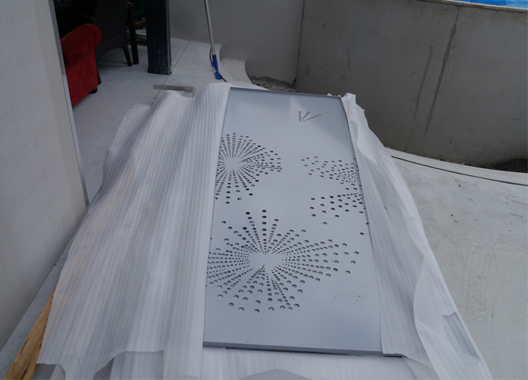
Full-scale paper mock-ups were printed, and we laboriously cut out the holes to test the perforation pattern.
Additional starbursts were added in the four outer corners of the panels, to maximize the lighting effect, and we introduced four recessed downlights for times when stronger lighting was needed.
The panels were fabricated in aluminium, laser cut and powdercoated in a dull silver colour that fitted with the new pavement finishes and existing house.
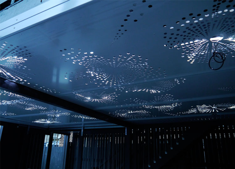
LED lights were installed above, and the panels fixed in place.
The colour of the panels changes over the course of the day, especially towards evening.
By the time the sun has set the backlights are twinkling and the panels themselves become virtually invisible.
Our client now loves to sit out under her own starry sky in the evening, and we are thrilled to have helped transform a forgotten and underutilised part of her house and garden into an artful, and unexpected beauty.
Now it’s over to you.
What did you think of the new Garland Garden ceiling? Perhaps it’s given you hope that a difficult part of your home and garden can be transformed into something you love. I’d also like to know if you enjoyed seeing the different stages we went through to design the final pattern. Let me know in the comments below.
And of course, sharing is caring, so if you know someone else who might find this interesting, why not send it on.
See you soon for more garden, landscape and design stories. Oh, and we’ll also be featuring more from the Garland Garden in the coming months.
Your Favourite Stories of 2013
It’s hard to believe the Landscapology blog has been up and running for six months now. In that time the number of people receiving weekly updates has more than doubled - thank-you for your interest and support! So as the year draws to a close, let’s take a look back at the stories that resonated most with our regular readers.
Here’s the Top 10:
10. A Celebration of Texture: sometimes the bumpy bits are the most interesting - our small selection of beautifully textured pavements, walls, walls, artworks and plants.
9. Design Class: make analysis your friend - the first of two simple guides to basics to looks out for and understand before you start designing.
8. Elephants never forget...and they can teach you how to read drawings - Trunky the Elephant's Design 101 guide to understanding plans, elevations and sections.
7. How I visited a park in Colombia and ended up with a book deal - as Future Park went to print I explained how the whole project came to be.
6. Visit Landscapology at Brisbane Open House - a sneak peek inviting people to visit the new studio. The follow up story of the day was also popular.
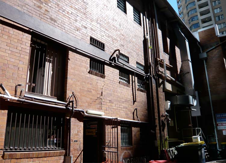
5. Back of House - celebrating the delights of the tangled, messy, not-for-public-view backs of our city buildings.
4. Is the frangipani Brisbane’s favourite summer tree? - the answer was a resounding yes! And this story was a tie for fourth place, with...
4. Landscapology’s 2013 Christmas Book Guide - last week's list of the books that have brought faraway landscapes closer to me this year.
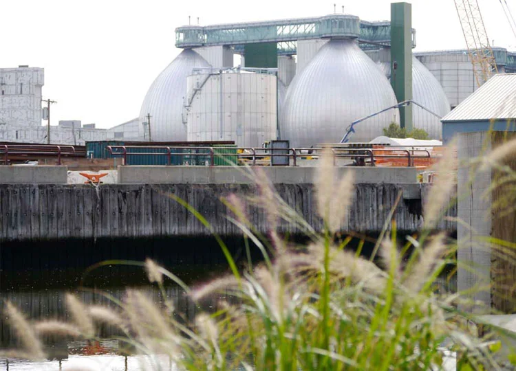
3. Serenity...in the least likely location - our tour through delightful Newtown Creek Nature Walk, next door to New York's biggest sewage treatment plant.
2. Big Prawn...yawn: THIS sculpture park features the biggest from the world's best - our visit to the amazing Gibbs Farm Sculpture Park outside Auckland.
1. Confessions of a sell-out: Future Park is launched! - my opportunity to thank everyone who has supported me along the long and sometimes rocky road to bring my book from dream to reality.
But now it’s over to you.
What’s been your favourite story this year and why? What would you like to see more of in 2014?
I’d love to know – please drop me a line in the comments below, or send me an email.
Of course if you know anyone who’d enjoy this article, please feel free to share. And if you've been sent this by a friend, consider signing up to receive a new design tip, feature project or Landscapology update in your inbox each week.
Stop by again next week when there will be more from the wonderful world of landscape, architecture and design.
All images © Amalie Wright, except Future Park launch photo, by Nicole Phillips.
A Story of Sexy Swales, Swirls and Stormwater
You and I are over 50% water, and water covers around 70% of our home planet.
Water is as fundamental to our survival as oxygen, yet we often take it for granted.
Next week I have the honour of giving a presentation to a wonderful group of people who make it their business to think about water.
My audience at the 8th International Water Sensitive Urban Design (WSUD) Conference will include the engineers, designers, scientists and policy makers who are at the cutting edge of thinking about water in our cities: how we get water when it’s dry; protect ourselves from it when it floods; treat and clean it; and how we manage the rivers, lakes and water bodies in our cities.
I’ll be talking about parks as a way of bringing people and water infrastructure together.
I’ve written about parks such as the Newtown Creeek Nature Walk before. The Nature Walk brings visitors bang up against New York’s biggest sewage treatment plant, and one of its most polluted waterways, yet still manages to provide a calm and artful oasis full of inviting moments.
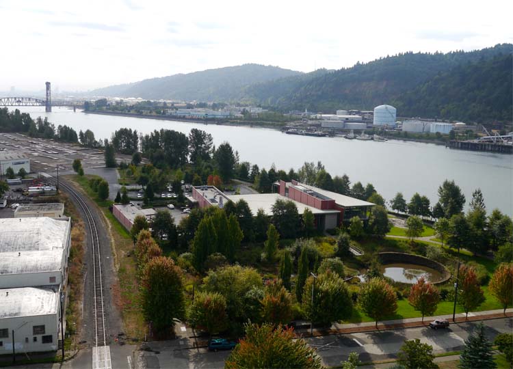
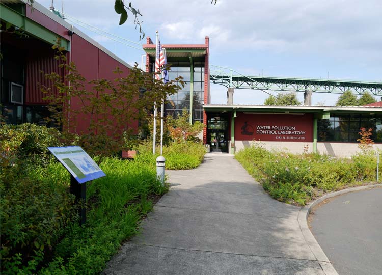
Today we’re heading to the opposite side of the US, to visit Portland’s Water Pollution Control Laboratory.
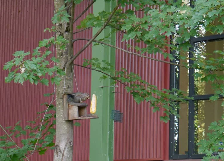
The Water Pollution Control Laboratory is the red building in the centre of this image, surrounded by extensive gardens. Downtown Portland is on the opposite riverbank in the distance.
Whilst WSUD is still a new concept to many people, this building, and its surrounding water sensitive landscape was established in 1997.
Approaching the Centre, remnants of former structures remain visible.
The building is home to the Portland Bureau of Environmental Services Pollution Prevention Services, which monitors water quality in the surrounding area. Six labs totaling 1,400 m2 provide start-of-the-art facilities for testing and identifying environmental pollutants.
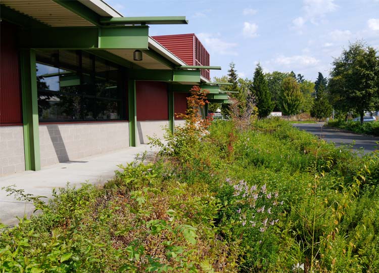
The building itself features many cost-effective, energy efficient elements, including the large roof overhangs...
windows that can be opened
and generous spitters that direct rainwater into the gardens below.
Rocks directly below the spitters absorb the impact of the falling water, which then spreads into the garden beds, irrigating the plants and allowing the removal of waterborne pollutants.
The garden beds form part of a landscape that educates visitors on alternative ways of managing pollutant-laden stormwater runoff. It treats the runoff from 20 hectares of surrounding streets, paths and neighbourhoods, as well as the lab’s carpark.
The 60-car parking area is also water friendly, with runoff being directed towards lushly planted swales. The planting really breaks down the expanse of asphalt – in some areas the cars are all but hidden – and provides space for shade trees.
Adjacent to the carpark are test plots, where different plant species are trialled for use.
The centrepoint of the landscape though, is the 6,000 m2 water garden.
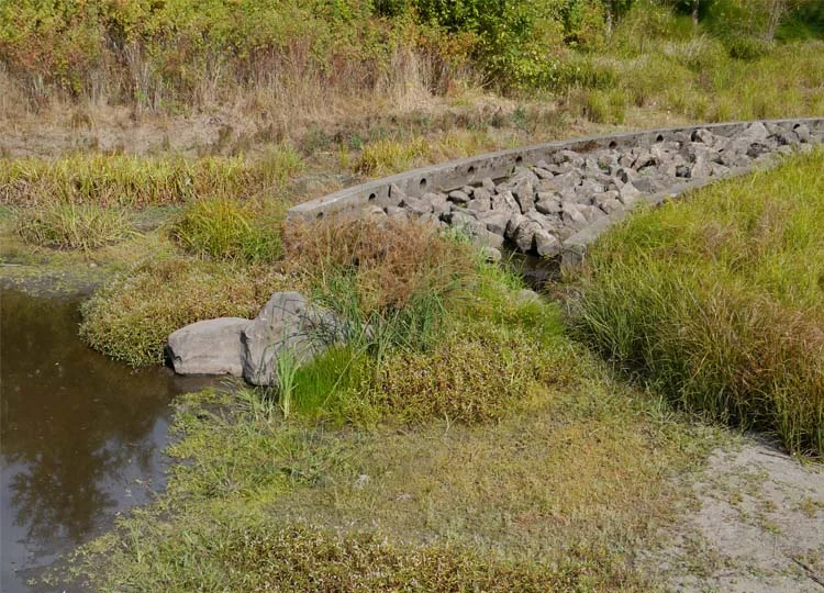
Water runoff enters via a rock lined channel, or flume, which slows it down. When it’s not raining this forms a sculptural element in the landscape. (Flume - what a great word! Flume. Flume Flume. I love it! Ahem...)
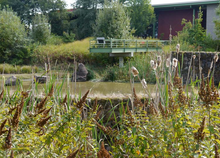
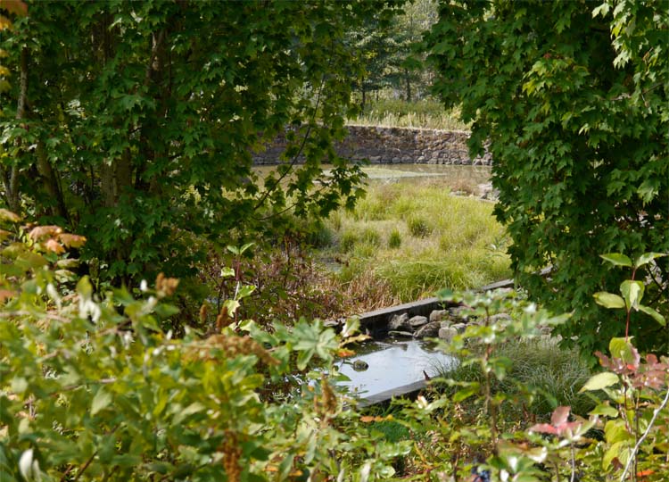
The water is then held in a pond, where it can be treated and either held on site, or released along a curving overflow into the river.
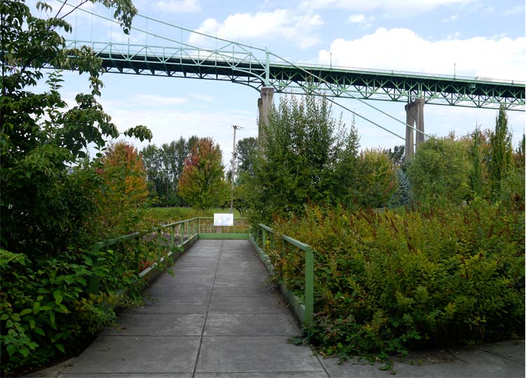
Lush aquatic and emergent planting surrounds the pond, and a lookout platform allows you to get right out over the water.
The lookout viewed across the pond...
...and on approach.
From there you’re taken on a journey around the pond, through well established planting that at times screens out views of the pond, the building, and even the St Johns Bridge.
It’s a delightful place to visit, and I imagine a great place to work or to take your afternoon cycle (this is Portland after all!).
The water garden was apparently a controversial element in early days. Even though the site had previously been used for industry, many local residents were concerned they would be getting another problem in their backyard, rather than an asset.
Effective monitoring and adaptation over time has ensured that the water garden functions well. And the initial decision to create a sculptural landscape, that integrated with the building and connected to its riverfront setting, has seen the Water Pollution Control Laboratory and gardens become a well-used, and much-loved landmark in the St Johns neighbourhood.
Now it’s over to you.
What do you think of the Water Pollution Control Laboratory? What element most resonated with you? Was it the simple building details that make it a more comfortable place to work, like opening windows? How about the carpark, full of planting that cools the temperature and, let’s be honest, makes it a helluva lot more attractive that just a baking sea of asphalt? And what about the water garden, with its gorgeous stone walls combining with a serious purpose and function?
I’d love to know – please consider emailing or dropping me a line in the comments below.
Of course if you know anyone who’d enjoy this article, please feel free to share. There will be more from the wonderful world of landscape, architecture and design next week.
The multi-award winning building was designed by Miller Hull.
The landscape, also multi-award winning, was designed by Murase Associates.
The sculpture 'Raindrop', is by artist Don Merkt.
All images © Amalie Wright and Richard Buchanan.
Read more about this and other co-location parks in Future Park: imagining tomorrow's urban parks.
Welcome: A Fun Day at Craigston for Brisbane Open House 2013
What a great day it was!
After months of planning, and some slightly frantic last minute efforts, Craigston opened her doors on Saturday as part of this year's Brisbane Open House.
We showed off our new studio, and two home owners graciously opened their fabulous homes to over 70 lucky people who had been victorious in gaining a place via ballot.
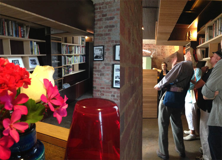
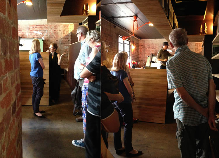
The calm before the storm... and our guests doing the Craigston Time Warp.
Amalie and Richard spruiking the finer points of the studio design.
Chatting with Open House visitors.
It was an honour to host you all here at Craigston, and we hope you enjoyed your day as much as we did.
A huge thanks must go to Charles Rowe, our BOH volunteer, who valiantly manned the welcome desk, and Nicole Phillips, who helped us in the studio whilst also taking these great photos of the day. An even bigger thanks is due to human dynamo Ann Rainbow, who manages Open House so brilliantly on behalf of the Office of the Queensland Government Architect. Days like this would not be possible without the efforts of people like Ann.
Now it's over to you.
Did you manage to get along to Open House? What buildings were stand-outs for you? I'd love to hear your thoughts in the comments below.
If you're in Queensland, don't forget that Maryborough Open House is on again next weekend. It was a huge success last year, so get in quick if you want to see some of the beautiful buildings on show.
All images ©Nicole Phillips.


