How much do we love New Zealand, huh? If you’ve ever spent a lazy Saturday enjoying Auckland’s waterfront before the realities of winter set in, you’d be forgiven for thinking this was the slice of heaven Dave Dobbyn was singing about, not some pouty chick...or Footrot Flats. (Go on, listen to it. Nothing better than a bit of da-da-da to put you in a good mood)
I enjoyed just such a day in mid-April, at the end of the brilliant IFLA landscape conference and Gibbs Farm sculpture park field trip. Judging from the crowds, about half of Auckland had the same idea.
Auckland has one of the kick-ass-est harbours in the whole world, and sailing seems to be a compulsory activity. Boats from all round the globe cosy up to each other in the berths. Just how sassy is Janice of Wyoming?
You can easily walk to the waterfront from the downtown area. If you’re coming from further afield the main Britomart train and bus station is just on the water’s edge. And if you’re heading for one of the harbour islands, this is the place to catch the ferry.
Auckland city was born at the waterfront in 1840. For a long time before that, the harbour was a vital, sacred part of Maori life. In recent years, spurred by hosting the 2000 America’s Cup and the 2011 Rugby World Cup, the working harbour has been gradually inviting the public back in. You can read more about the redevelopment, including the different precincts (Wynyard Quarter, North Wharf, Karanga Plaza, Silo Park and more) on the Waterfront Auckland website.
Here are my favourite moments:
1. Lay out the Welcome Mat
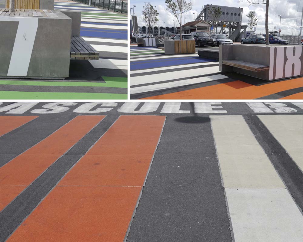
This supergraphic barcode helps pedestrians navigate two carparks connected by an operating bascule bridge on their way to Wynyard Quarter.
2. Pop-up Library
Here, another welcome mat is laid out. This time it’s artificial turf that marks a little gathering spot in front of a shipping container library. Lilliputian furniture can be moved around to suit the sun.
3. Containers
Why stop at just one. The information kiosk deftly stacks containers into a sculptural heap to anchor one corner of Karanga Plaza. The public loos are here too, and it makes a natural backdrop for events and performances. The day I visited there was a piano in the plaza (tick!) and students played all day to advertise an upcoming concert. Special mention should also go to the superbly attired lady whose fabulous orange trousers hit just the right note beside the containers. Respect.
4. Different Types of Seats
Sometime different types of furniture can make a place look untidy and feel disjointed. That doesn’t seem to be the case here, maybe because the bridge crossings, changing path widths and varying neighbours make each of the precincts along the waterfront feel different anyway.
The seats in Karanga Plaza roll back and forth on rails. They’re also great if you and your friends can’t bear to be apart for even a moment. The seats along North Wharf look like miniature versions of the piled-up shipping containers. The seats outside the Viaduct Event Centre are bar stool height, behind a long concrete counter.
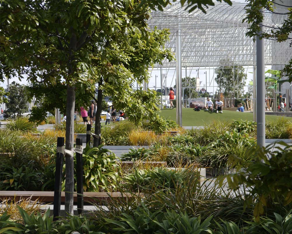
5. Oasis
At the end of North Wharf, before it erupts into a giant playspace, is this quiet pocket with places to sit out of the hustle and bustle.
6. Playtime on Steroids
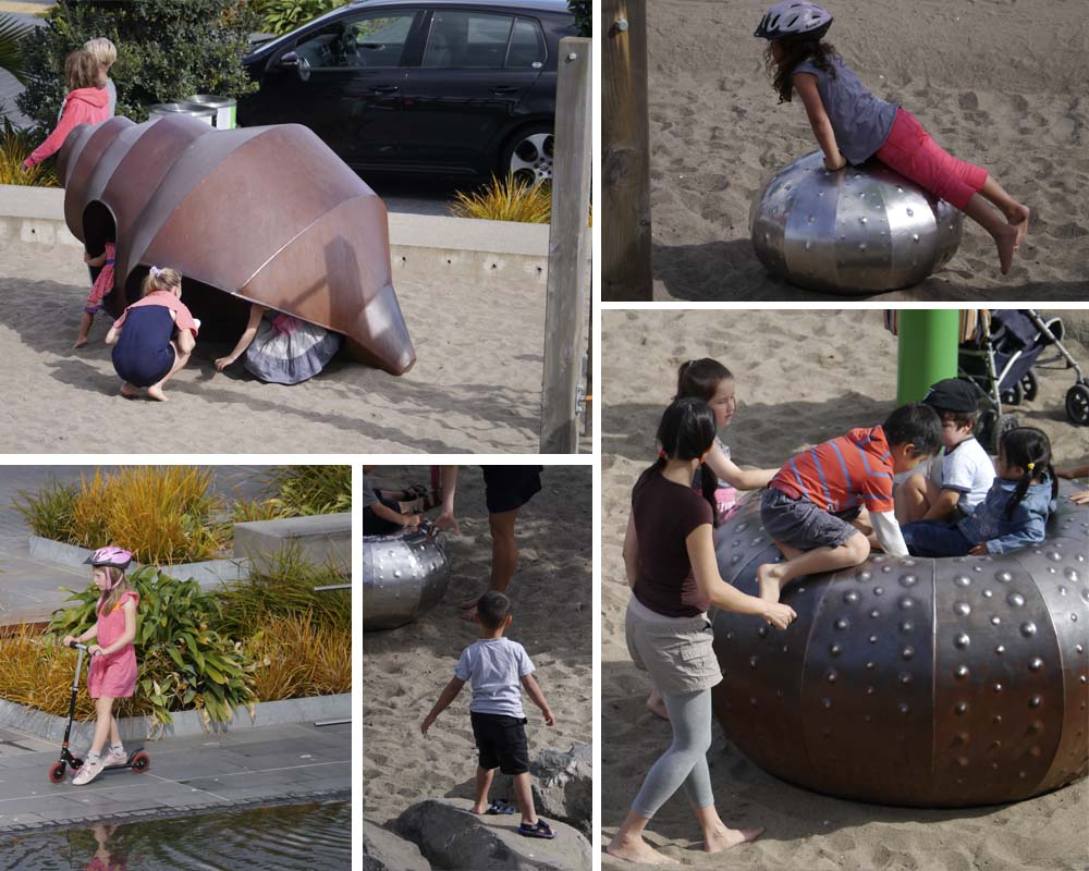
Pros: This massive wonderland of play imagines what this part of the sea was once like. Giant shells, barnacles and other creatures can be climbed over, sat on or spun around and around. There’s also nets and swingy things, a vast bed of sand and a low wall of stones for practicing clambering and balancing. At the end of the play area is the sculpture Wind Tree, relocated from its former city home to a new shallow reflecting pond. It doesn’t take much grey matter to figure out that this also attracts kids like crazy.
Cons: it’s so big because this is apparently a future development site. Let’s hope some place for play remains and it doesn’t all turn into a dreary, but revenue-generating, 9-5 office building.
7. Sexy Water Management
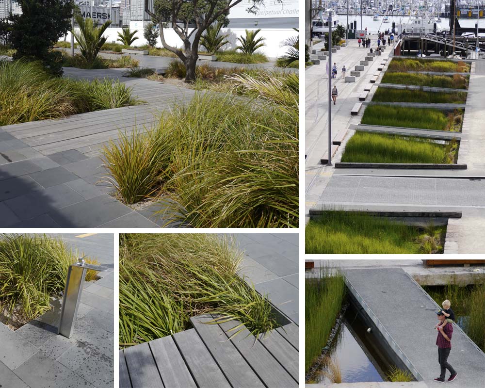
This is not just some pretty planting behind the containers, although it does look great. Look closely and you can see that the planting beds are set down below the paving. This allows water to run off into the planting where it’s filtered and cleansed before going back into the harbour.
The same thing happens at Silo Park at a much bigger scale. Stormwater runoff here is directed into a long linear channel, densely planted again, and criss-crossed with paths.
8. Working
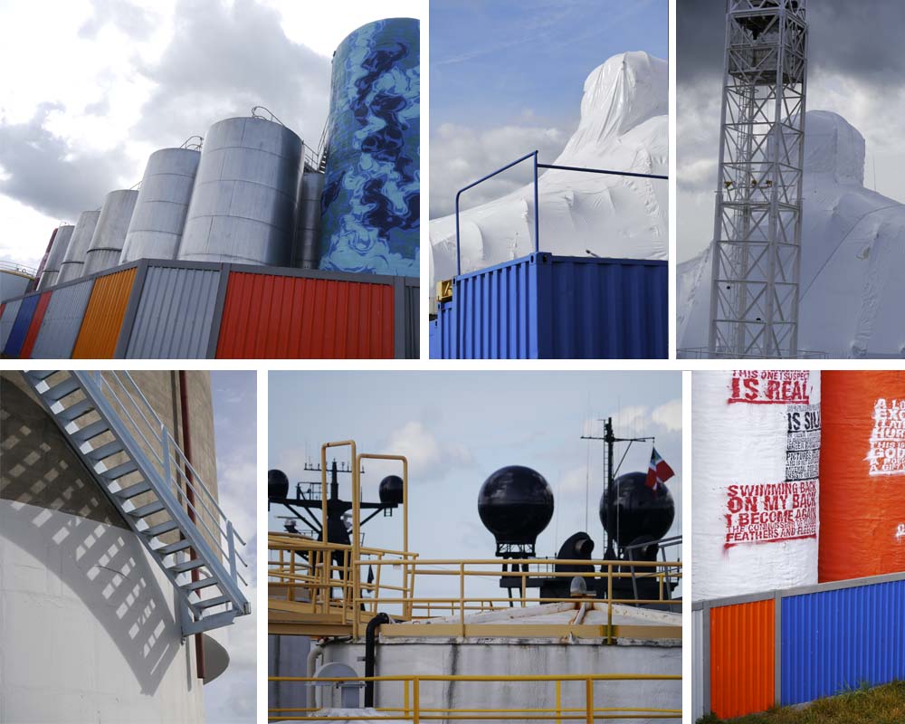
I love most about this part of Auckland’s waterfront is that it’s very much a working harbour. The navy occupies a vast land holding to the east, and there is an gigantic shrink-wrapped vessel being repaired down near Silo Park. All very cloak-and-dagger.
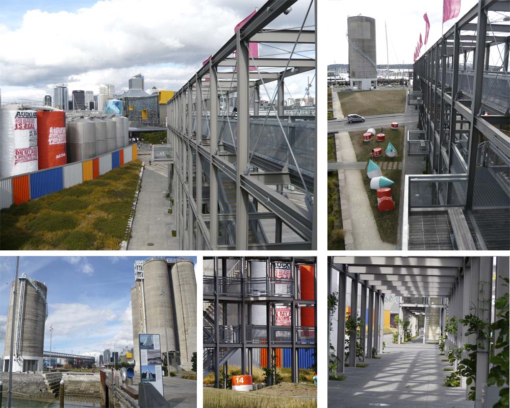
Whilst disused silos form the backdrop to Silo Park, the silos of the bulk storage facility dominate the scene. Some are painted and act as huge sculptural installations behind the gantry.
These sites operate around-the-clock, constantly bringing life, activity and people to the waterfront.
It’s a delicate balance, essential to get right, but for me it would be disastrous if all of this stretch of harbourfront was ‘cleaned up’ and industrial activities moved on to somewhere ‘out of sight’.
9. Gantry
This 12m high, 110m long structure was built to 'screen' the bulk storage tanks behind. Climb to the top and you'll get a great view into this part of the harbour that I find just as interesting as the parks and promenades, maybe more so.
It also reveals long views back towards the city, and along the entire waterfront public places, and is a perfect spot to watch life unfold.
10. Weddings, Parties, Anything
The waterfront is a go-to place for quality Auckland people-watching and overheard conversations:
“I never knew this place was ****ing here, bro.”
“I know, bro.”
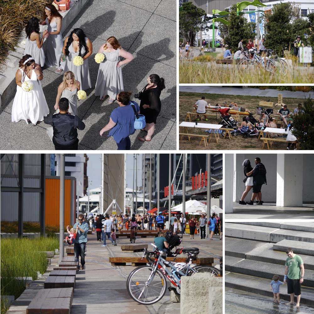
In just a few hours I saw plenty of tourists, but also locals who’d come down for a function, a wedding party having photographs taken, kids riding bikes, people running and exercising, those who’d brought their lunch with them, those who were headed for a restaurant, and those who were lining up for a pie or a coffee or a smoothie to have while sprawling at the picnic tables or on the lawn. Little kids were in the playground, bigger kids were at the basketball court. The temporary summertime stalls were busy and the summer movie nights were still being advertised. Students lounged, couples canoodled, and the blue sky hung on as long as it could overhead.
And that’s the secret to great public space – enabling all different types of people feel welcome.
What do you think? If you’ve visited the Auckland Waterfront recently how did you find it? Leave a comment below letting me know what you liked best.
If you know someone who’d enjoy reading this article be sure to share it, and check back soon for more from the wonderful world of parks, gardens and landscapes.


